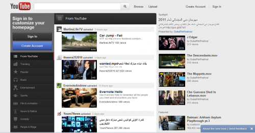
Let’s be honest, YouTube’s homepage design is a little dated and hasn’t changed much over the past few years. Thankfully, Google, the owners of YouTube, wised up to this fact and have created a brand new redesign for the popular video website.
As with all of Google’s products, YouTube’s facelift makes it look very current and similar to Google+, Gmail, etc. The black bar that runs atop most Google product pages isn’t present, although. However, this is consistent with Google’s plans to remove this bar anyway. A light gray background has also been added across all of YouTube for a consistent look.

The goal behind the redesign is to help users discover and share YouTube videos socially. The first thing users will notice is an activity feed in the center of the page, similar to Facebook, or well, Google+. This feed is populated by videos from channels you subscribe to.
You can filter the subscription feed using the navigation bar located on the left side of the screen. For example, you can selectto have no filter so all videos from your subscriptions appear; you can filter it to videos your friends have recently shared on connected social media accounts, like Google+, Facebook, Twitter, and more; or you can filter it to videos from one specific channel. This filteringhelps you easily stay up to date with your interests and with what your friends are watching.
What’s more, in the middle of the left navigation bar are categories of videos aggregated by YouTube. You can choose from Trending, Popular, Music, or Entertainment videos. Additionally, there is a section of suggested channels that is formed algorithmically from your previously watched videos.
On the right side of the screen is a column of recommended videos. The videos that appear here are based on your previous video-viewing activity. When a video is watched, another takes its place, and the whole stream of recommendations might change to better reflect the last watched video.
The YouTube redesign is definitely a step in the right direction. It’s apparent across the internet, mostly due to the Like, +1, and Tweet buttons, and Facebook’s new Open Graph concept, that social recommendations are more than a glimpse of the future. Since many YouTube videos become popular due to social sharing, the social-based recommendation idea is a welcomed addition that is better late than never.
Do you like YouTube’s new design and social features? Did they forget something? What would you change? Please share your opinion.
Paul works in marketing for CliqStudios, a kitchen cabinets manufacturer that sells black kitchen cabinets at discount prices.


Add Comment