


What is the first thing prospects notice about a brand? A logo, of course! When designed right, logos can create a memorable brand image. But done wrong, the brandmark can even scare them away.
If you are new in the entrepreneurial field, you would probably be thinking about the types of logos you want to display your brand with.
To lend your hand, we have come up with 20 inspiring examples of single-letter logo designs. You can refer them to get your logo designed the same way.
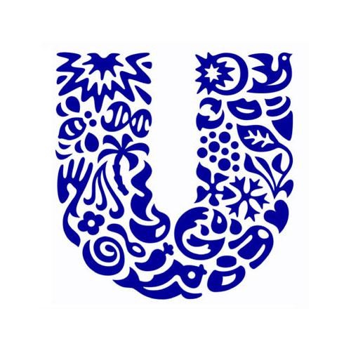
The multinational company dealing in consumer goods has a single-letter logo forming the first letter of its name “U.” Do you know the logo design has 24 icons altogether to create the U shape? Every icon stands for the core values of Unilever.
Some of the most visible icons are— the sun, flower, hand, DNA, hair, sauce or spreads, container, bird, wave, recycle, and frozen.
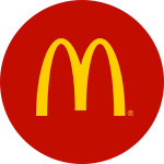
McDonald’s is famous for having the golden arches as a brand symbol. In 1962, the company incorporated it in its logo. It stands for stylized restaurants. The recent golden arches were embedded in 1968. It resembles the letter “M” which makes it a widely recognized logo all around.
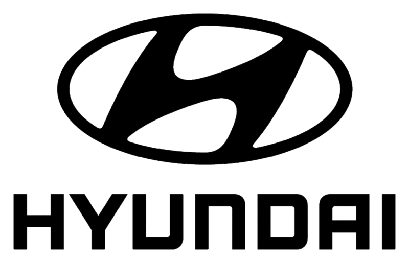
When you observe it for the first time, it looks like the letter “H” in italicised format. But that’s not the case. Observe closely, and you will see two people shaking hands. That’s the company’s motto behind designing it in such a way. The oval surrounding the logo represents its global expansion.
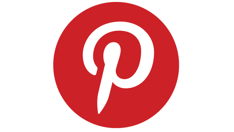
Pinterest’s logo design consists of a badge similar to the head of a pin. The contrasting red color with the letter “P” in white shade signifies the brand perfectly. The symbol represents both its name and its purpose in one glance.

The widely used CMS platform has a logotype as its brandmark. It includes the letter “W” that stands for WordPress in an enclosed circle. Look closely, and you will find safety margins around the letter W. It’s minimal and clean.
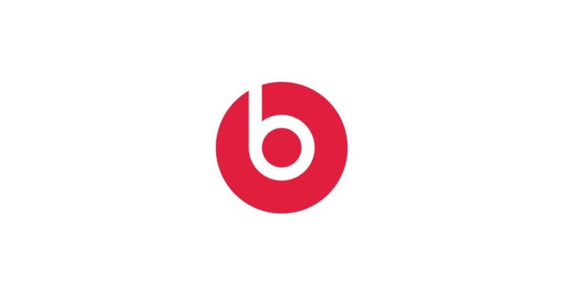
This logo is minimalist, creative and of course unique. The symbol signifies the core meaning of the brand. The smooth wordmark with an illustration showcases what the brand stands for. The letter “B” represents its name while the clever use of illustration in circle relates it with headphones. However, at certain angles, it looks like a disk as well. It means the brand is into the music industry.
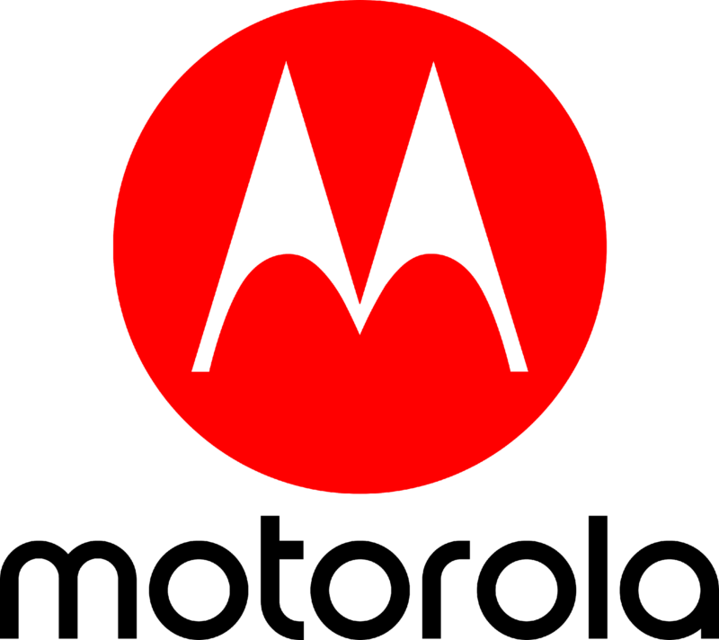
Since its launch in 1955, the Motorola logo has undergone a drastic change. The letter “M” is represented in the form of batwing. The symbol stands for quality and innovation that the brand represents through its mobile phones and devices.
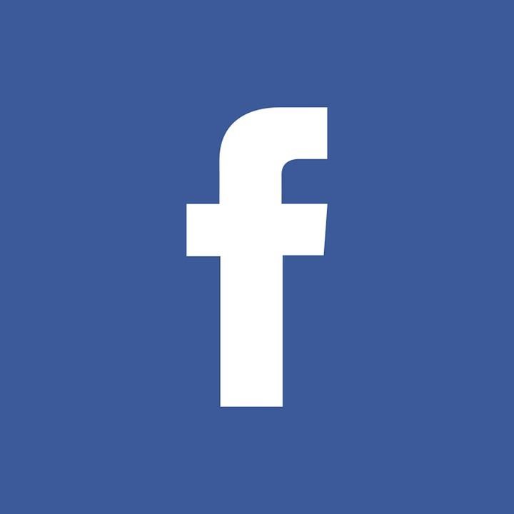
The social media giant’s logo is one of the most recognizable logos in the world. It includes the letter “f” in the white shade against a blue background. It’s minimal, simple and memorable.
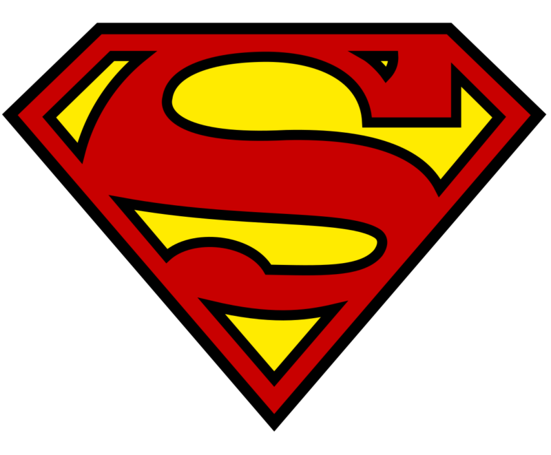
The Superman brandmark represents the iconic sign of Superman— one of the fictional DC characters. It shows the letter “S” symbolizing Superman in a diamond shaped enclosure. The yellow and red colors give it a striking look with an emphasis on the wordmark.
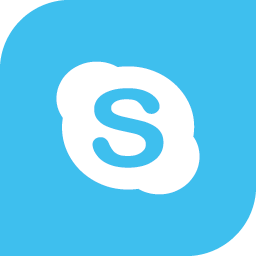
If you look at the Skype logo, you will find the perfect use of a single typeface. By ditching its fluffy cloud-like look, the logo has gone broad in terms of the wordmark. It now looks more consistent and reflects the brand essence.
It has a single “S” letter in its signature blue shaded cloud with white typography.
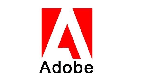
Have you seen Adobe’s logo featuring a stylized A? It was created by the graphic designer— Marva Warnock, who’s the wife of John Warnock. The use of red and white colors creates a contrasting effect and gives the logo a unique identity.
The logo is based on its original insignia that features the full name of the brand —Adobe Systems Incorporated.
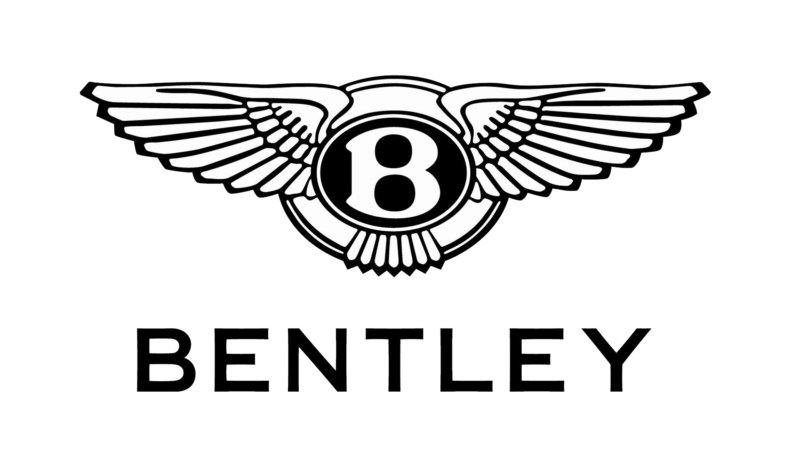
Established by Walter Owen Bentley, the company is British manufacturer as well as a marketer of SUVs and cars. Perhaps, you haven’t noticed, but it has an interesting corporate logo.
The logo incorporates the letter “B” obviously taken from its founder’s first name. It’s framed under a pair of wings that depicts the aerospace business of Mr Bentley during WWI.
The use of color has been limited to white and black only that gives it a minimal but effective appeal.
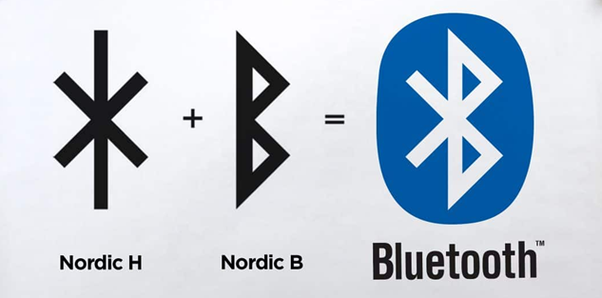
We have had seen this logo in our phone many times, but hardly we know its meaning (besides we know that it’s used to transfer files across devices). Anyway, let us clarify it for you. “Bluetooth” stands for the Anglicized nickname referencing “Halard Blåtand.” He’s the Danish King and his first name “Harald” means Bluetooth in English.
As far as the logo is concerned, it came from the unique runic alphabet of Harald Blåtand where Hagall is denoted by ? and Bjarkan is by ?. The Bluetooth logo is a mix of these two.
Interesting, isn’t it?
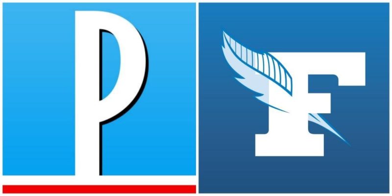
The two logos from the popular daily morning newspaper of French “Le Figaro” are perfect examples of minimalism. In its first one, the design features a quill pen in a stylized form that pierces the “F” letter. It refers to the pen and the history of the newspaper. The Le Parisien logo has the colors the same as in the French flag. It stands for its national distinctiveness. Both the logos have a blue color that symbolizes trust, truth, and knowledge.
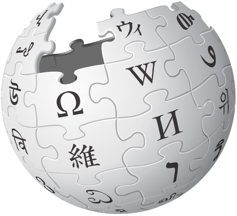
Wikipedia’s logo is minimal. It uses Linux Libertine typeface that indicates 19th-century books. This font is free that means you can use it too!
The logo comprises of the letter “W” that stands for its name as implied.
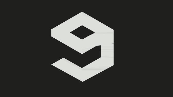
The logo references the conception of the site. As each of its pages contains nine publications, the logo creatively depicts its meaning. The shape of the logo appears as a cubical number that when reversed looks like the letter “G.”
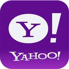
Originated from the “Gulliver’s Travel” book, Yahoo symbolizes extraordinary actions. The logo comprises of the letter Y with an exclamation mark. The color purple makes it truly stand out.
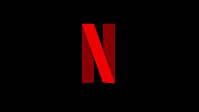
If there is one brand that has gone beyond utilizing a single letter with minimal aesthetic appeal, that’s Netflix. The color red against black creates a striking visual identity and makes it memorable. It evokes the feeling of being in a movie theatre perfectly.
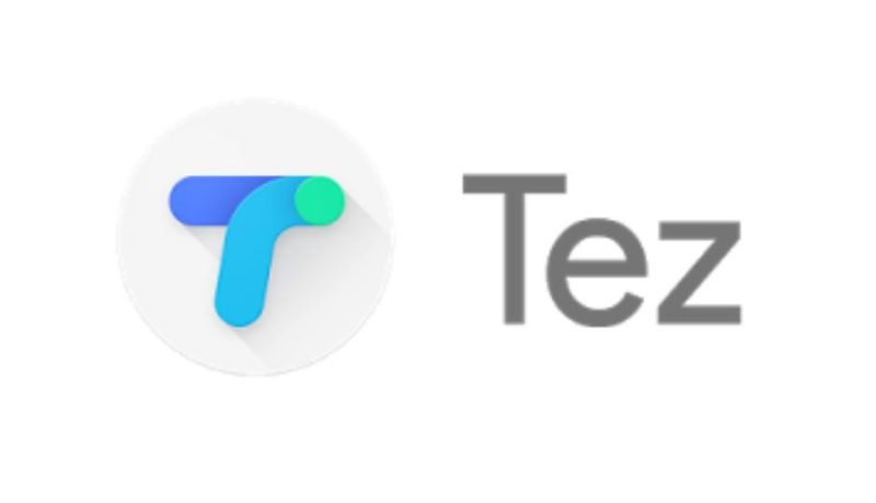
Google Pay Tez is a mobile payment app focused on targeting Indian users. The logo includes the letter “T” with three shades of blue. As its slogan is money made simple, the wordmark has been used in that sense to showcase quick money transfers.
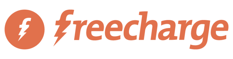
India-based pre-paid mobile charge service has an attractive logo design. It features the letter F in a flash-like shape. It stands for lightning fast service that the brand stands for.
The use of white and orange shade gives it a contrasting look to grab attention.
Conclusion
Which one-letter logo did you like the most? Feel free to share your ideas with us in the comment section below.

Add Comment