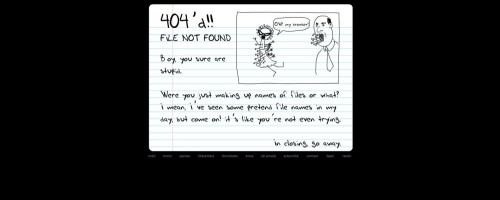
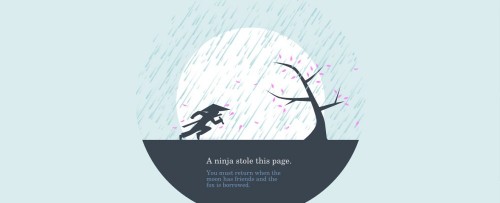
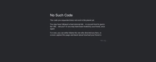
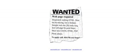
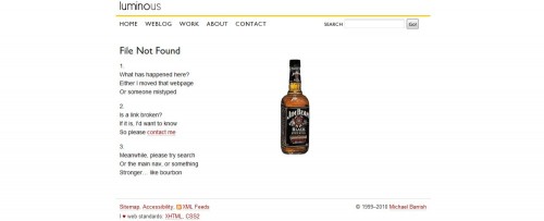
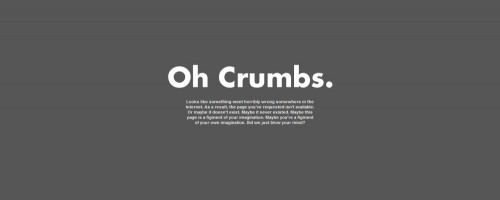
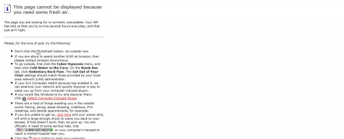
404 error pages appear when website users click a broken link, taking them to a page that has been removed or whose address has been changed. But while the experience itself is a nuisance, a 404 error page doesn’t have to be all bad. In fact, it’s become a growing trend that 404 pages are where even the most serious of companies and big businesses can have a little fun, poking fun at themselves or the user, or simply the 404 error experience itself.
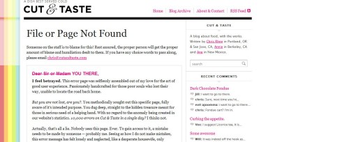
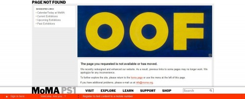
The following thirty examples show the myriad ways in which 404 error pages can actually be a great outlet for creativity. The range of options is unlimited. A 404 error page can consist of computer humor, like 8 bit Peoples or IDZR’s pages, continued website themes, like MoMa or Heinz Ketchup’s, playful accusations, like Cut and Taste or Homestar Runner’s, or even serve as the symbol of an existential crisis, like Spiritual but not Religious or Telltale Games’ pages. Still otherscontain haikus, cute cartoons, and complex designs. Some 404 pages even take advantage of themomentary pause to tell their visitors to get off the computer and go outside!
1. 8 Bit Peoples
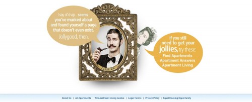
2. Apartment Home Living
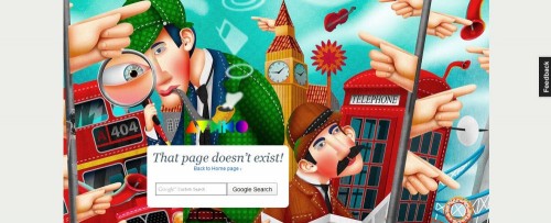
3. Audiko
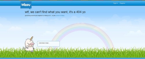
4. Blippy
5. Brandstack
6. Chelmsford Public Library
7. Chris Jennings
8. Cooklet
9. Cut and Taste
10. CSS Tricks
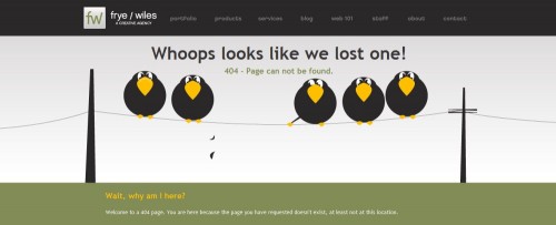
11. Frye/Wiles
12. Heinz
13. Homestar Runner
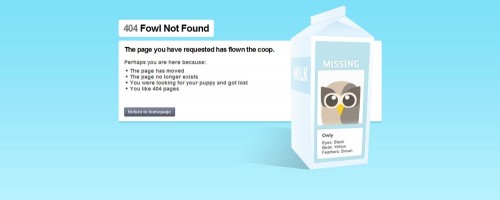
14. Hoot Suite
15. Huwshimi
16. IDZR
17. Limp Fish
18. Local Fitness
19. Jack Fig
20. Jotsai
21. Luminous
22. MoMa
23. Ook
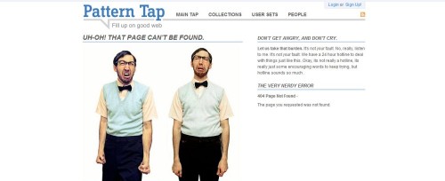
24. Pattern Tap
25. Serene Destiny
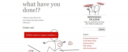
26. Spinning Plates
27. Spiritual But Not Religious
28. Telltale Games
29. Urban Outfitters
30. Ziff
















Its wonderful….I gonna use them because I am a Web Designer…
Saw this one recently too, who can resist a puppy based 404 page?
http://make-studio.co/404.php
This one is in Spanish, but is nice
http://www.elcuchitril.es/404
The guinea pig has eaten the page XD
i love the :Frye/Wiles
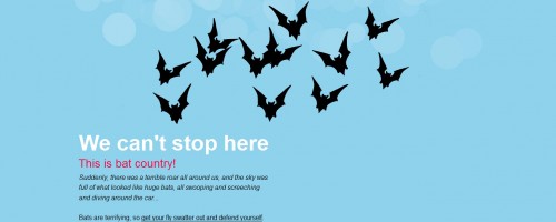
the Birds say:
Oops we lost one
funny!
I saw this one recently also… Good design and Funny!
http://thereisaspecialplaceinhell.com/404
These are some great ideas that I should incorporate into my web site as well. I like the idea of creative 404 Error pages as I think viewers of the site won’t get so put off by them and will still continue to explore the web site.
Amazing that people spend so much effort on a beautiful 404 page.
Another 404 but in czech language http://www.coex.cz/404
Our web guy is making a whole lot of them as we speak.
They our inspired by the old TV color bars:
http://www.racecar.no/404
(just press refresh and you will see new ones)
Nice sample 404 pages, favourite is number 11 – Whoops…
Like the use of comedy in these, would keep me on the site longer if I hit a funny 404 rather than the default one.
Really Cool!!
If you’d like, you can check mine out.
http://www.kbjdesign.net/oops.html
I wonder how much time the webmasters have spent coming up with creative 404 pages? Maybe I should spend a little more time and create a good one as well.
Here is one more creative 404 page template hope you will like it.