


An integral part of a website’s identity, from the web design point of view, is the typography used.
Earlier, typography effects were either technically unsupported or supported by only a handful of browsers. However, things are better now and websites are able to employ creative typography effects in their web design and engage their visitors.
Typography trends are never static and keep changing with time. The latest trends on this front are quite interesting. Read on to know more about the current typography trends in web design.
1. Bold Hero Fonts Are Beautiful
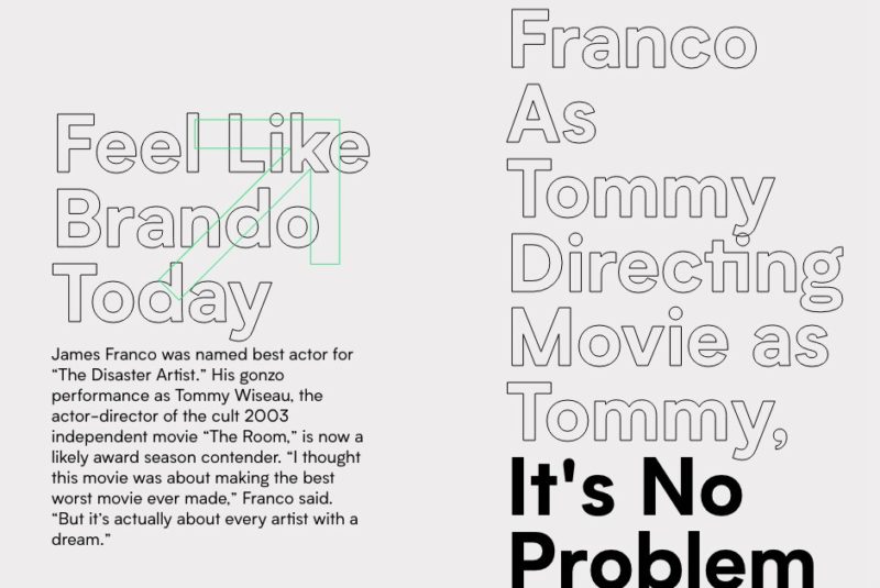
Using bold typefaces assigns a compelling personality to your textual material, which may even overpower the effect of using hero images and videos as the main design and/or multimedia element. This kind of typography is mainly helpful when certain text needs to be the center of attention.
It is important to understand that when it comes to websites, the text is not just a visual element, but they do the bigger job of conveying the voice and tone when communicating the personality of a product.
When a web page is made of a number of visual components such as icons, images, emojis, audio, and so on, the copy needs to be able to hold its own too. This is where big, bold fonts come into the picture.
You can even use them in paragraphs as this will create a dramatic effect and look like the main design element of the page. Such font is especially effective in helping brand names and headlines stand out.
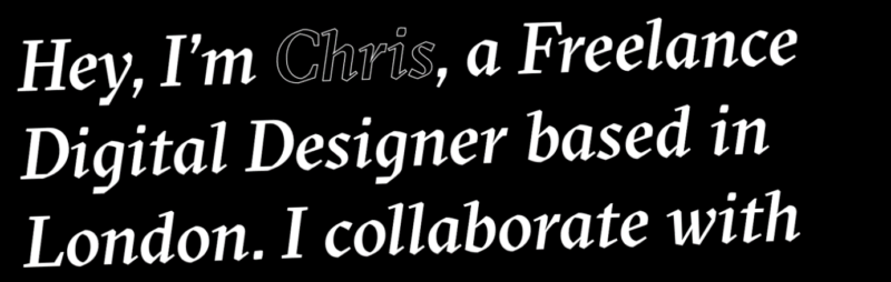
2. Say Hello to Serifs

Everyone knows the Serif fonts and just when you thought they’re getting old, they’ve made a comeback with a bang!
Serif fonts are well known for adding qualities of elegance and sophistication to text. They bring warmth and character to the text, but definitely cannot be associated with minimalism. These features make serifs the preferred font for branding and ecommerce websites that can employ storytelling to make a humane connection.
Think chic titles and refined headlines spruced up and delivered in serif fonts like Calluna and Minion. They are sure to leave a lasting impact on onlookers. Serif fonts typically pair well with sans fonts, particularly when you want to assign a business-like but friendly tone to your web design. For an even more personal tone, go all out with dual serif!
3. Highlighted Text, Anyone?
One of the critical functions of typography is to create and communicate the order in which content is going to be presented. This goes a long way in enabling readers to browse through it easily so they can take their pick of what they want to read. However, when designing the website, you need to ensure that readers read the most important messaged on your page. Enter: highlighted text.
Particular text can be emphasized upon by adding colorful and ingenious highlights to it. Designers can use color to highlight a chunk of text or underline a single word in a sentence to make certain elements of the typography more noticeable compared to the rest.
If you want to move away from the usual practices of providing white space and illustrations to make text stand apart, consider highlighting anything that you want readers to click on and/or read.
4. Play with Geometric Font

Geometric typefaces weren’t always popular, but they’ve been getting increasingly popular over the last couple of years. They call for the use of bold, clear, clean, straight lines and perfectly round circles, and are devoid of any influence from serifs or ornamentations. This is why they lend a sleek, modern look and work well for web designs meant for science or engineering and the like.
More often than not, geometric fonts look futuristic and can bring about an air of erudite sophistication. They can be viewed clearly from a distance, which makes them perfect for being used in branding.
5. Vintage Is Evergreen
Vintage typography is decorative and can add a dose of the old-world charm and character to any web design. It may not always be refined, and sometimes appear either rough and raw or decorative.
Needless to say, this typography is highly effective in lending a classic touch to the modern, thereby striking a fine balance between the old and the new.
Websites that are into commercializing artisanal or beauty products may find this font particularly complementary to their design as they typically prefer typography that is classic, decorative, yet clean.
6. Dabble with Hand-drawn
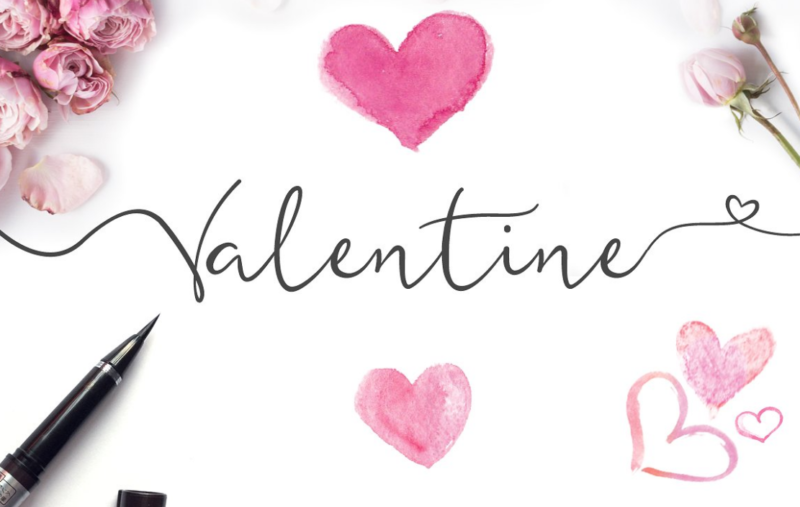
Hand-drawn fonts bring an unpretentious casual charm to any web design they’re used in. Because it is drawn by hand, each font can be drastically different from the other, which makes them unique.
Earlier, this category of typography was considered more feminine in appearance, but in recent times, there have been fonts that look masculine and rough-around-the-edges. This makes this typography extremely appealing and perfect for website sections where you want to create an emotional appeal.
7. Make a Splash with Colors
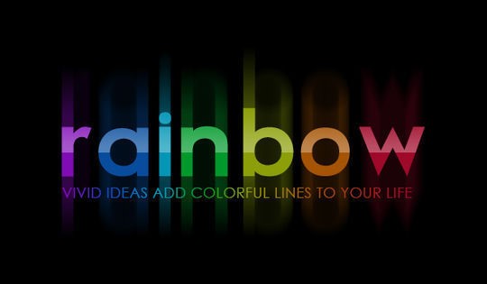
The global and timeless appeal, the user-friendly interface and the possibility of adding color as another dimension to typography makes it easy for designers and brands to add identity to their designs. So whether you’re into web design in San Diego or in Timbuctoo, you can make the most of this typography in your web design.
Color fonts are SVG data that are stored in OpenType fonts. The wide range of OpenType features allow the inclusion of raster (non-scalable) and vector (scalable) images. Hence, depending on the type of SVG data, they can be vector or raster. Compared to monochromatic fonts (which can be colored multiple times), they’re less flexible, but can store gradients, textured and other graphic effects.
Conclusion
When it comes to web design, the typography goes a long way in keeping visitors interested and communicating messages and other content with the right amount of impact. It is crucial that web designers and website owners stay abreast of typography trends so that their website looks consistent with their vision, and dazzles visitors every time they come over. However, it is important to note that trends change with time, which is why designers need to keep revamping the typography to keep their portal relevant and fresh.
(Image credit: 1, 2, 3, 4, 5, 6 & 7)
Author Bio:
Les Kollegian is CEO of Jacob Tyler, San Diego’s Top Web Design & Branding Agency specialized in Web Design, User Experience, Brand Development, Marketing Strategy, and Digital Marketing.


Add Comment