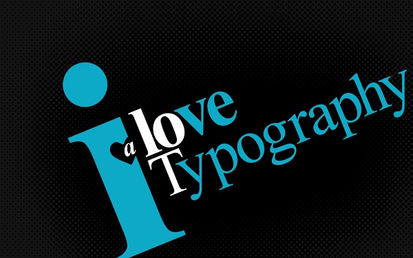
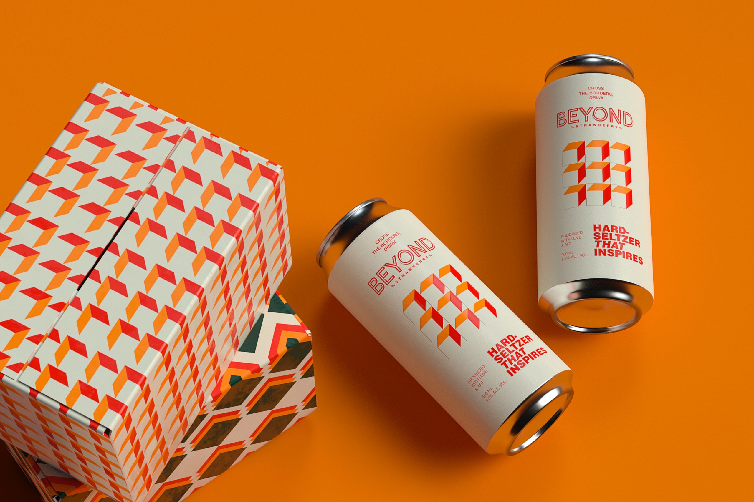
A better typography can improve the overall performance and design of the site. If you want to convey your message more effectively to your visitors, then you should have your messaged typed correctly. Do you still have some issues with your typography? Do you want to know what kind of common that makes the worst typography? You might be a newbie to tying or you might be an expert too. Whatever it is, just make sure that you check the following points to avoid any kind of typo errors while designing a website and make your content reach all the visitors with the original meaning and value of it.

Do not include too many fonts in your webpage
There are different varieties of fonts available and you get access to all of them too. However, it is neither a rule nor necessary to use maximum fonts in your webpage. Doing so will completely spoil the look your webpage content. Without even going through the content, the visitors will step back from your website. It is normal to use just 2-3 fonts for a webpage. It will make your website to look completely professional. If multiple fonts are used in your website, then the visitors will get distracted. Reducing number of fonts in your website improves the readability of your site.
Focus more on kerning
Kerning is a white space that you leave between every word. If you do not care about kerning, then it will produce a worse effect on your content. The look of your content will be worse. If you improve it, then your website will be looking better. You should always keep in mind about kerning. It is a simple process to adjust the space between the words. Initially, it may take more time for you to adjust the space manually, but later you will get used to it and the manual editing process will become easy for you. You can do it quickly, if you have a better experience.
Do not use decorative fonts for large texts
If you have some large texts to be included in your webpage, then use some simple font types for it. You shouldnot use decorative fonts for the same. The decorative fonts can be used in headings or for lesser lines of texts. The decorative font for larger texts will make the texts more confusing and unpleasant. You should mainly focus to increase the readability of the content. Just try to write a large paragraph with decorative font and use a simple font for the same. Compare both and you judge yourself which one looks better. Obviously, the simple font will be most suitable for larger lines of text.
Focus on hierarchy or order of the texts
Using perfect font type, colour and font size can go useless, if your content hierarchy is not the best. Hierarchy is important for the webpage content to make it more easily readable. Using title tags on your content is also important. For crucial sections, you can use bigger title tags and for normal content, you can go for small title tags. Based on the type and importance of content, do change the font type, colour and size. For example, choose increased font size, an attractive colour and bold font for the heading. For larger texts, use simple font.
Never use Comic Sans font
You should not use Comic sans font for any of your webpage content because using it makes your content more unprofessional. The readability will be completely affected, if you choose this font. Most of the web designers have shifted from Comic sans font, but you may not believe the fact that there are still so many web designers available who wishes to use this font for writing their content. Always go for another font. You have so many better fonts than Comic sans.
Break the rules sometimes
You should always keep the rules in mind. However, occasionally you can go beyond the rules. Use the correct font type and size majority of the times, but sometimes try to mix up the things and review. If you get a better output, then keep it as it is. In the reverse case, try some other combination.
Proper alignment
Do not make all your texts centre aligned. Do prefer to use a grid. Depending on the text type, try to align them in a better way. At the same time, do not make your messages to stay in the corner of the page. Wherever it is needed, align the texts to the proper places and make your content more attractive and readable.
This guest post is by Janice. Janice is a creative writer and wallpaper enthusiast. She is a big fan of HD Desktop Wallpapers @ Blogorola. She also visits CuLogo Wallpapers to download cool HD wallpapers.


For a blog post on typography, you would think that the author knows what the definition of kerning is. Kerning is not the white space between words, rather the process of adjusting the spacing between any and all characters.