


Look around you. Irrespective of where you are, you would be greeted by a multitude of smart phones or new-age phones of every model that the market has to offer, with a pair of intent eyes scanning the screen. You would be surprised to know that only half of that time is spent in attending and making voice calls; and the rest in accessing their favorite websites even when they are on the go. Therefore, big or small, if an enterprise wants growth, mobile website development should be given as much importance as the desktop version and should no longer be treated as its cheaper cousin. A recent survey on global internet traffic validates this claim:
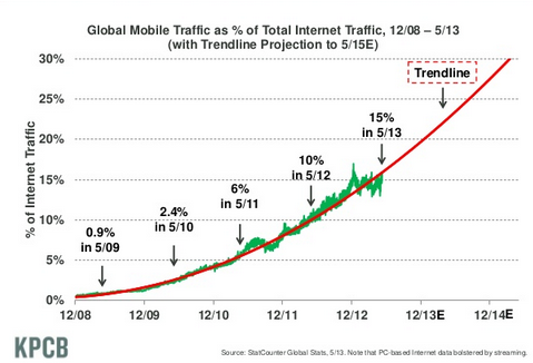
(source: http://www.assuredlabor.com/blog/2013/08/ )
Before you start going about designing your mobile website, it is important that you understand the dynamics of this niche market. Designing and making it SEO and user-friendly is just as important as understanding how much and what information needs to be put up on it. For one, the screen being smaller, a number of desktop loyalists find the process of accessing mobile internet tedious, as hopping from one web-page to the other or downloading takes more time. Hence, each aspect needs care and attention:
Design / User Experience

Even though the number of mobile internet users is increasing at a never-before rate, there still remain certain glitches. For instance, typing in queries and navigating around the site is a time-consuming process. Using a touch-screen device ends up making the experience even more cumbersome. Moreover, it’s not very convenient working with a touch-screen keyboard. Memory and bandwidth also remain a problem. Certain factors that come into play also make the loading of the page slower:
- cache memory being smaller
- slower HTML and JavaScript parsing
However, the recent growth tells a different side to the story: that the mobile experience is a whole new world that promises more geographically suited results (the buzzword being ‘localized’) to the users for one. This happens through the use of mobile apps (applications) such as Android, Windows, iPhone and iPad that track your exact position and then deliver geographically precise results to a query.
As a business enterprise, it is important to iron out these glitches so that users can access your website seamlessly and keep returning to do so:
- Keep the web-layout attractive, uncluttered and easy to navigate around, by incorporating anchor links on one side of the page (especially the landing page).
- The headings should be crisp and the area to be tapped, big enough (for bulky fingers!)
- Understand that the user is pressed for time (probably on the way to work in the morning rush); and design and create content accordingly.
- Track what is it that the user demands to access, through desktop-site analytical results and prioritize and place key content, such as company address, about-us, product info conspicuously.
Call-to-action
- Form-filling should be as easy and short as possible.
- Text should be lucid and crisp, informing users about what would happen if they click on the label.
- Use sharing tools to social-networking sites as call-to-action.
- Call-to-action should be placed such that it cannot be missed by the user.
- The colour should be in contrast with the rest of the webpage (orange being a highly recommended colour).
- Create a level of urgency so that users feel compelled to click is also an effective strategy.
Remember, more traffic would mean more sales.
SEO-friendly
The mobile screen being smaller, users prefer typing in the name of the company / product they need to access, into a search engine. Here are some statistics that will give an insight into the when, where and how:
- Shoppers using mobile coupons at their local grocery stores: 41%
- Shoppers using mobile coupons at clothing stores: 39 %
- Mobile searching before making a purchase: 50 %
- 64% of Smart phone owners are now using their mobile devices to shop online
Sources: Nielson, Digby, eDigitalResearch
Making the website, therefore, both user / response-friendly as well as optimized for search engines. But mobile SEO varies from desktop SEO, because of apps, that completely change the rules of the game.
Google holds sway in mobile browsing too, with 4 out of the 10 apps on the market (Play, Youtube, Maps and Gmail). GoogleNow, its new-age component that will act as your ‘personal assistant’ when you are mobile browsing through Android and iOS. Other big names include Bing, Apple and Yahoo.
To ensure that these search engines (as well as the niche ones) do not exclude your website, it is important that it is:
- Responsive: implying that all elements on the site, including images and content can adapt and load easily on all devices, of different screen sizes and apps; but also
- Adheres to the Google’s mobile-website guidelines.
- Website should not block Googlebot from crawling of assets, such as JavaScript, CSS, images).
- Keep a single URL (as far as possible), as it would serve two purposes of optimization:
- Sharing around social networking sites would become easier
- It would support Google’s algorithms while assigning indexing properties for the content.
Alternatively, separate URLs can also be employed in the form of a prefix ‘m.’
Coding
HTML5 has emerged as the new buzzword in mobile coding, as its features can easily adapt (degrade) to simpler devices as well. The coding tools that are available include HTML5, JavaScript and CSS. They help support any animation tools that you wish to incorporate.
They also have more advanced features, through which videos can be uploaded: by providing a default link to a video file and consequently using JavaScript to help replace the link by the video tag in HTML5.
Implementing Coding best practices are just as important a part of the mobile website creation as others, perhaps even more. Proper coding ensures that the website loads faster, and user interaction remains easy. Some Do’s to getting an optimized mobile version of your website:
- Ensure that your web-designer keeps the mark-up lucid and lean, as only then would your website be able to load seamlessly on different kinds of devices, with varied screen sizes.
- Images as a part of the web layout is a whole different ballgame altogether. Keeping in mind the size of the screen, it is advisable to stay away from images. But if you do, ensure that they are small and low resolution; and they do not incorporate text.
- Website should even be able to support devices with no or poor JavaScript, which in turn can only be done when markup is streamlined.
Ironing out these glitches is imperative, because at any given time, at least half of your customers (including prospects) are accessing the mobile web. Therefore love it, hate it, there is no escaping it. The global internet traffic has officially moved into the mobile age and the sooner you jump onto the bandwagon, the better it is for your business.
About the author
Ananya Srivastava, a tech writer working with EnablingBiz eSolutions – a leading Internet marketing and web agency that offers a wide range of Internet marketing, web design and development services including mobile website and mobile app development. EnablingBiz also provides white-label services to design and development firms in North America and Europe. Join us on Facebook


Add Comment