Today’s business sphere is full of branding materials. All the efforts and elements are applied to get the words out there. But one element that remains unquestionable is — a logo.
A logo isn’t just the way to recognize a brand. It is the catalyst that stimulates brand identity. While some of the logos look unique, some appear unattractive, and some look like a clever work of art. Based on the usage, purpose, value, and brilliance, we have gathered a list of 50 logos for your reference. While some of them are created using a logo maker, others show the shrewdness of thought-process going into the creation.
These logos have been designed cleverly to showcase a brand’s purpose and leave a memorable impression. Let’s check it all one-by-one.
- Lion Bird — symbolically clever
Look at the bird’s eye for a few seconds and see the image of a lion emerging out of it. That’s the brilliant use of symbolism that a logo depicts.
- Iron Duck Clothing — simply the best
A regular hanger symbol with a little customization became memorable. It’s simple but memorable. It is a combination of a brandmark and lettermark logo types.
- Spartan Golf Club — visually symbolic
Spartan Golf Club logo design shows the brilliant use of negative space. Utilizing negative space has always been a challenging subject for designers. However, it’s also been an opportunity to show their creative knack. When you look closely, you find that the logo has a symbol of a man playing golf. But when you pay a little attention, you find that it resembles a soldier with a Spartan helmet. As far as the name of the brand is concerned, it’s written in a simple font just below the symbol.
- NBC — colorfully iconic
The iconic logo of NBC features a peacock in white shade. The five colors represent its feathers. Each of the features symbolizes the separate division of NBC. Of course, it’s yet another example of utilizing negative space! The peacock looking at the right has also a hidden meaning. It stands for look forward.
- The VIA Logo — simply the best
The Canadian railway corporation VIA’s logo isn’t just iconic but also brilliant. The white space between ‘V’ and ‘I’ and again the ‘I’ and ‘A’ resembles two parallel lines. Both the lines symbolize railway tracks. The subtle hint of railway track makes it one of the clever logos.
- Amazon Logo
The online marketplace — amazon’s logo is one of the thoughtfully designed logos of the world. Notice the yellow arrow running from the letter ‘a’ to the letter ‘z’. It represents that the company carries everything from a to z. Plus, the arrow also makes a smiley face which shows customer’s satisfaction.

- Circus of Magazines — two-in-one symbolism
It’s a very clever logo that makes most out of the name of the brand. Look at the symbol closely. What you find, at first glance it looks like a circus tent. Put a bit more focus and you will see a pile of magazines. That’s brilliant, isn’t it?
- Formula 1 — simply clever
Every one of you would have witnessed it many times. But have you ever paid close attention to its logo? Notice the empty space in the center. It looks like 1. F1 = Formula 1.
- FedEx — a hint of symbolism
The courier delivery service is yet another example of brilliant use of negative space. Look at the white space running between the letter E and X. It resembles an arrow that stands for the company to moving forward. Isn’t this subtle hint a clever depiction of FedEx’s fast service?
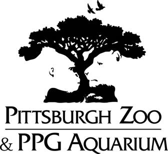
- The Pittsburgh Zoo & PPG Aquarium — brilliant & meaningful
Yet another logo design that signifies the name associated with it. A simple look brings you an image of tree and birds. But a little close attention takes you to the faces of a gorilla at the face and a lion at the right. You can find the symbolism with ease if you look at the negative space closely.
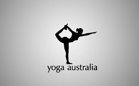
- Yoga Australia — hidden map
It features a woman doing yoga. But there is a hidden symbolism between the woman’s leg and her arm while making a pose. It creates the Australian continent’s map which is really brilliant!
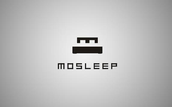
- Mosleep — symbolism in initial
This organization helps people who are dealing with sleeping disorders. The initial of the organization’s name ‘m’ has been used to create a logo. It resembles a bed that reflects the purpose of the organization.
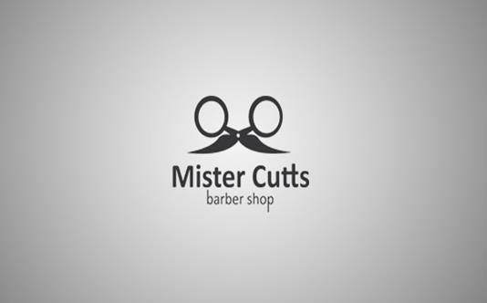
- Mr.Cutts — the barber shop
The regular scissors have been given a funky but symbolic look. The scissors appear to have mustache which says that it’s for men’s grooming. Similarly, cosmetic logos can be designed cleverly to show the main feature of the business either it is service or product.
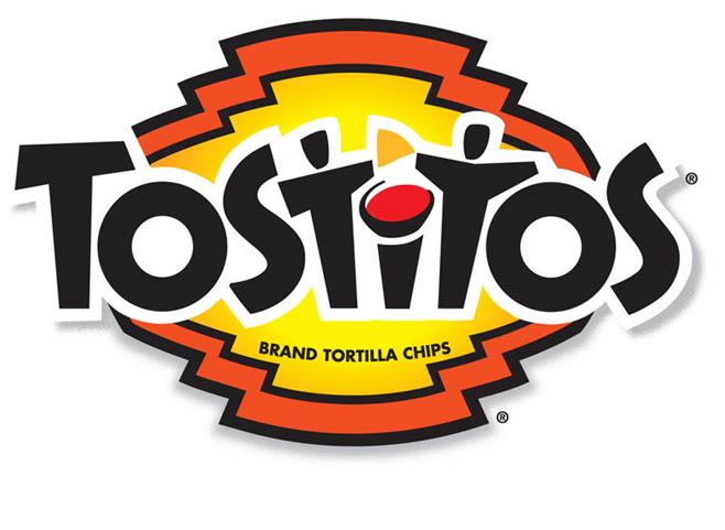
- The Tostitos — fun stuff
The party favorite Tostitos has a symbolic logo design. The two letters ‘T’ & ‘T’ look like people dipping the tortilla chips into the salsa made out of the letter ‘I’. That looks like fun!
Anyone who doesn’t have any knowledge of core designing can use a free logo creator to make symbolic logos.
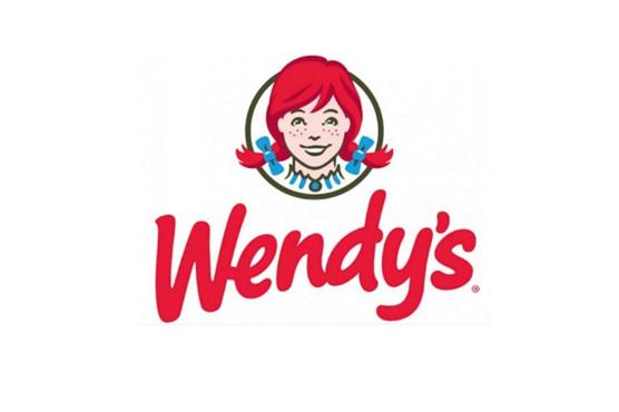
- Wendy’s — great brand identity
The international restaurant chain is famous for rendering meals with a home-cooked feel. Don’t believe us? Look at the Wendy’s collar (logo of course). Did you find the word “mom” written around it? Isn’t it a clever logo?
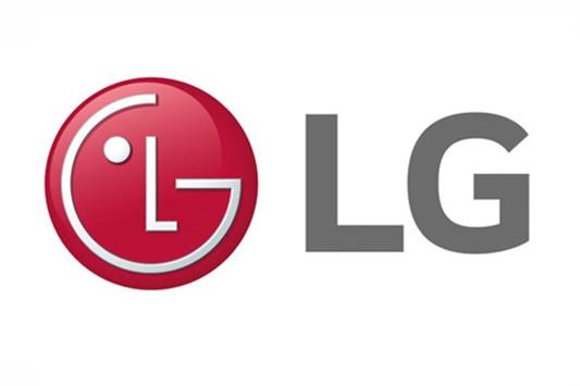
- LG – simple but meaningful
It appears to be a modified Pacman for some. But LG’s logo design is simple but effective. The G appears to be a face with a wink and L making a nose. Its simplicity makes it stick in people’s mind.
- Toblerone — symbolically WOW
Toblerone— the Swiss chocolate brand has a unique brandmark. When you take a closer look at the mountain logo, you will find an image of a polar bear.

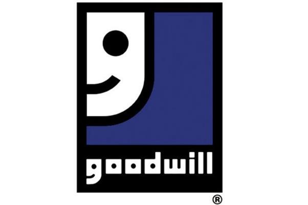
- Goodwill Industries International —Symbolism in word
This community-based organization is famous for making other’s lives better. You can find its mission reflecting from its logo design. The initial “G” of Goodwill word symbolizes a smiling face.
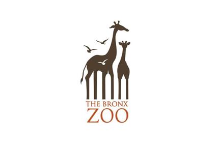
- The Bronx Zoo
It’s the largest zoo located in North America. Besides, The Bronx Zoo is the largest metropolitan zoo around the world. Its logo design portrays birds and two giraffes. Look closely between the giraffes’ legs. The negative space between the legs has been turned into the iconic skyline of New York.
- Toyota
The brand’s iconic logo has an oval-shaped symbol. The overlapping ovals stand for the unification of customers’ hearts and the products of this brand. The background space stands for its technological progress and immense opportunities ahead.
- Baskin-Robbins
This largest ice-cream specialty chain has a logo in pink and blue shades. When you look at its BR it looks like the number 31. Well, this number symbolizes the brand’s belief that guests should taste new flavors. Hence, 31 stands for every day of the month.
- The London Symphony Orchestra
This minimalistic logo in first glance spells out LSO. But when you look at it closely, it resembles like a conductor instructing the orchestra. The letter ‘L’ and ‘O’ look like his arms.
- HACI (Hope for African Children Initiative)
HACI is involved in providing support to the African communities. Its logo clearly depicts this message. Look between the yellow and the orange negative space. It shows a mother and a child and the African continent.
This pin board website has a simple but significant logo. The letter ‘P’ looks like a pin.
- The Tour de France
Well, this logo includes a cyclist’s image. Look at the letter ‘R’ to find it. Isn’t it great?
- Sun Microsystems
Notice the U shaped elements in its logo. What do you find? It resembles the word ‘Sun’.
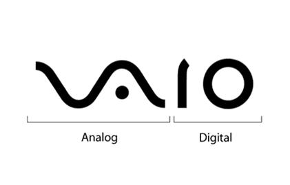
- VAIO Computers
VAIO Computers’ logo includes analog and digital symbols. It’s definitely a great example of the custom typeface.
- Mr. Couch
Look at the couch! It looks like a face with a mustache. Symbolically great!
- Artfarm
As the name implies, the logo of the farm depicts its meaning the same way. Four pencils creating a fence as a farm give it a meaningful design.
- CodeFish
Look at the logo design. It fits true to its brand name. In just a single look gives a clue what the brand is all about. A fish created of symbols used in coding.
- Apple
It’s the most subtle and memorable logo of all time.
- Chair Entertainment
The letter ‘h’ turned into a chair symbol perfectly sums up the meaning of this brand.
- Mailhouse
Look at the open envelop which gives the resemblance of a house. Isn’t the logo relevant?
- WordRefuge
The logo comprises of an open book which gives the impression of a refugee tent. It’s definitely a good visual treat.
- Cisco
Look at the series of lines running above the brand’s name. It represents the iconic Golden Gate Bridge of San Francisco.
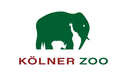
- Kolner Zoo
The logo features the image of an elephant. Look at the negative space between the legs of the elephants. There you will find a giraffe and a rhino. The back limbs of the elephant have been turned into two spires of the famous Cologne Cathedral.
- Museum of London
In first glance, the logo may look simple. But when you pay close attention to the background, you will find that it symbolizes London’s geographic area.
- Unilever
The initial of the brand has been taken to create its logo design. The letter U includes many random images which symbolize the brand’s different aspects.
- BMW
The luxury car brand’s logo reflects its history. It features a circle with a white section that stands for moving propeller and the blue section that signifies the sky.
- Beats
Beats headphones are liked by almost every audiophile. Look at its logo and you will it wearing one too. Isn’t that relatable?
- British Heart Foundation
The logo clearly shows a heart shape with electrocardiogram reading. It signifies what the brand stands for.
- The Guild of Food Writers
The firm is known for writing about food. The logo smartly depicts it with a spoon cleverly marked in an ink-pen nib.
- Continental
This tire manufacturing company has a minimal logo design with a subtle hint of its business. Observe the letters ‘C’ and ‘O’. The white space between these letters creates a tire.
- Washington Capitals
It looks like an ordinary eagle until you pay close attention to the negative space just below the eagle. The blank space creates the famous Capitol building of Washington.
- British Blind Sport
Look at the background where you will find the flag creating the shape of a rugby ball as well as an eye. It symbolizes the sports and its purpose both.
- Roxy
The female clothing section of Quicksilver — Roxy’s logo is minimal but effective. The logo includes a heart-shaped structure which is actually the combination of two Quicksilver logos!
- Coca-Cola
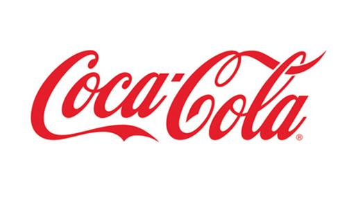
Now, you would say what’s special about Coca-Cola’s logo than a custom typeface? Well, the negative space between the letters ‘O’ and ‘L’ resemble the Danish flag. The brand utilized it while promoting in Denmark.
- San Diego Zoo
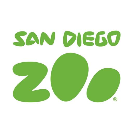
There is a hidden message in the logo of the San Diego Zoo. The word ‘Zoo’ resembles an animal’s paws.
- Eagle Consumables
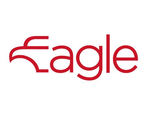
The custom typeface gives this logo a unique and memorable look. The initial of the brand look like forming the shape of an eagle.
Conclusion
We hope that you have enough dose of logo inspiration from this list. Whether you are a pro or an amateur, you can use a logo maker online to create your logo with ease. Take ideas from the earlier list and start creating one!
Author Bio:
Jelly Shah works as a Digital Marketer, brand consultant and business strategist with Designhill- A reliable marketplace for logo design, business card maker, cosmetics & beauty logo, customized & personalized tank tops design, and many other designing works. With extensive experience working both client side and within the agency environment, he has authored several articles on topics related to digital marketing, business strategies, content marketing etc.



Add Comment