Color can be an important visual communications device that can intimately affect the psychology of the observer on a subconscious level. It can help determine a consumer’s relationship with a given product or company and play an important role in branding.
Color can evoke a wide variety of emotion and even memories. An individual’s interpretation of color will depend on factors like their age, nationality, profession, interests, and personal preference.
It therefore can’t be stated strongly enough that to use color effectively, you must completely understand your target audience.
For example, when faced with a new product, consumers place color and visual appearance (93%) above other factors such as texture (6%) and sound and smell (1%). It’s also interesting to note that 85% of shoppers cite color among the main reasons for why they buy a product.
And other studies have shown that color increases brand recognition by as much as 80%. That’s an amazing statistic when you consider that branding relates directly to customer confidence.
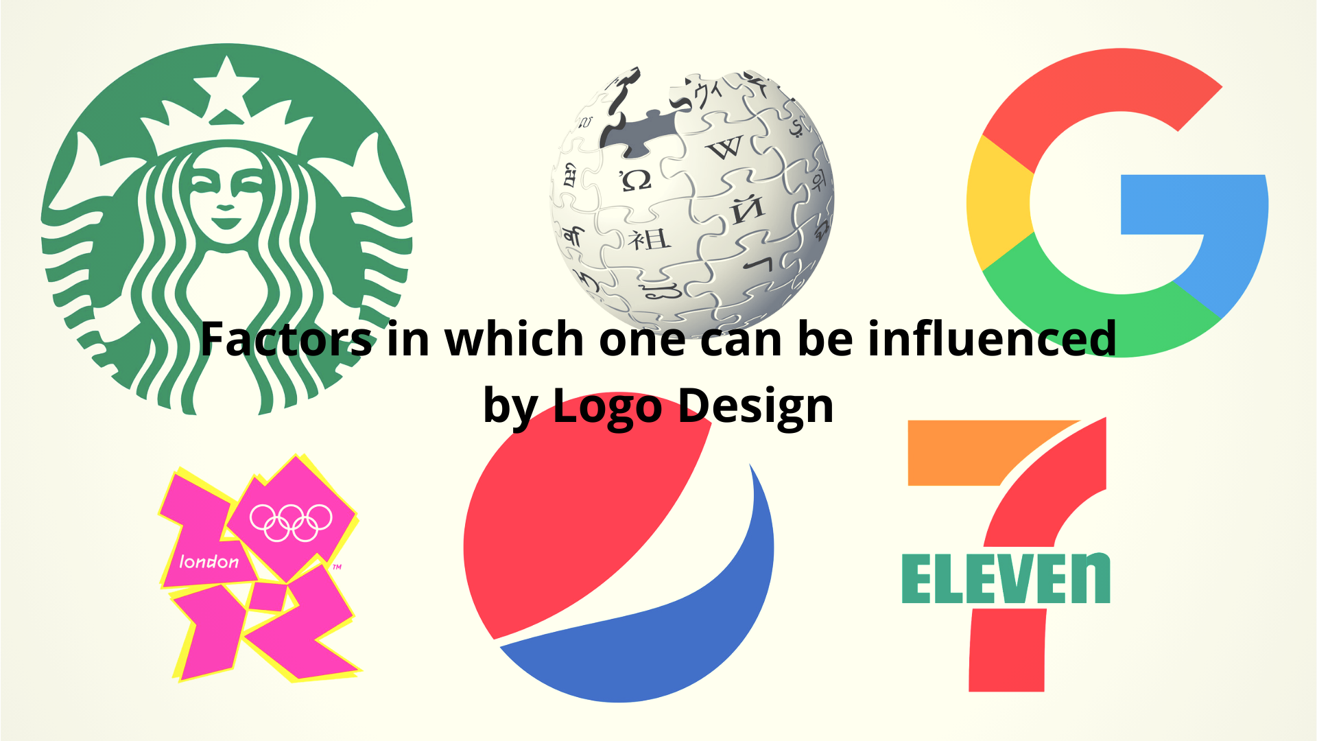
You’d be wise to consider the ramifications of color when designing a logo. Here’s a basic guide to the psychology of color…
Red is the perfect color to get people excited and to draw attention. In fact, cognitive studies have shown that the first two colors that the brain processes are red and yellow. Red can be used to create a sense of urgency and actually increases the heart rate of the viewer.
Conveys: excitement, passion, strength, sex, aggressiveness, boldness, speed, desire, courage, determination, lust, impulse, action, danger, hard, angular, rigid.
It’s interesting to note that while red is the color of action and aggression, pink is one of the most calming of all colors. In fact criminals are sometimes housed in pink cells because studies have shown that the color pink reduces anger and aggression. Spiritualists consider pink to be a higher frequency color moving one toward enlightenment, and pink appeals to more traditional buyers.
Conveys: love, romance, soft, calm, serenity, cool, tranquility, motionless, unperturbed, fantasy, tradition.
Blue creates a sense of trust and security. Blue also has a very long wavelength and can be seen from far away. It’s why most airport landing lights are blue. But different shades of blue can have a different impact. Royal blue for example, appeals to impulse shoppers and is great for clearance sales, while navy blue appeals more to budget shoppers, and is better for institutional and corporate logos. More people cite blue as their favorite color over any other.
Conveys trust, reliability, belonging, coolness, dependable, trustworthy, friendly, calm, tranquility, serenity, water, seriousness, power, success, professionalism.
Yellow is often used to grab the attention of window shoppers, It conveys a sense of optimism and youthfulness. It is a color associated with food. Yellow appeals to intellectuals and can enhance concentration though it can be hard to see if used improperly. The brain is stimulated to release more serotonin (natural feel-good chemical) when confronted with yellow. Yellow promotes and conveys creativity.
Conveys creativity, warmth, happiness, cheer, sunshine, youth, optimism, hope, food, stimulating, expansive, curiosity, playfulness, amusement, energy, comfort, laughter, good times
Green is the color of nature, ecology and wealth. It’s the easiest color for the brain to process. Dark green appeals to the conservative, masculine, nature, while light green is commonly used in hospital rooms for its calming effect. Light green is also used in retail environments to promote calm, and is a popular food color. Use darker shades to represent stability and influence. Green can be associated with good luck, generosity, fertility and even jealousy and envy on the negative side.
Conveys Nature, peace, nurturing, harmony, recycling, good luck, fertility, generosity, envy, conservative, masculine, calmness, growth, abundance, healing, life, balance, rejuvenation, stability, influence.
Orange appeals to impulse shoppers and creates a call to action such as buying, selling or subscribing. Can be used to convey movement and energy without overpowering the viewer. Can convey a new attitude.
Conveys vibrant, energetic, friendly, inviting, warm, creativity, affordability, enthusiasm, playfulness, flamboyant, good times, adventure, attitude.
Young girls frequently select purple as their favorite color. It stimulates brain activity related to problem solving. It can lend an air of mystery, wisdom, and respect. Purple is the color of royalty and is often seen in anti-aging and beauty products. Darker shades can convey wealth and luxury while lighter shades convey spring and romance.
Conveys royalty, wealth, prosperity, mystery, respect, wisdom, problem solving, nobility, dignity, abundance, creativity, imagination, luxury, spring, romance, spirituality, justice, fantasy, dreams, feminine.
Black is often used to market luxury products, It’s powerful and sleek and can be used to convey authority and power. Black is a serious color frequently associated with intelligence.
Conveys luxury, power, authority, evil, intelligence, elegance, seduction, mystery, modern, thin, sleek, formal, sophistication, secrecy.
Gray represents neutrality and calm. Not a great color in logo design but can be used to convey the timeless quality of things.
Conveys practical, neutral, timeless, middle-of-the-road, old age, death, taxes, lack of energy, stagnation, indifference.
Brown represents stability, experience and comfort. Also used to convey nature, friendship, reliability and the earth.
Conveys stability, nature, friendship, earth, tribal, primitive, simplicity, experience, comfort.
Study after study has shown that color conveys subconscious meaning, so color can be a powerful psychological tool in logo design. It can send a positive or negative message, encourage or discourage sales, promote or discourage trust, and even stimulate chemicals in the brain. The proper use of color can make or break your logo design.


Add Comment