


When designing a favicon your company logo can give you a good foundation to start with. But if you want an effective favicon that your audience will instantly associate with your company you’ll still have a bit of work to do. As long as you steer clear of these 6 common design mistakes you’ll be able to create something eye-catching.
Starting with a negative mindset
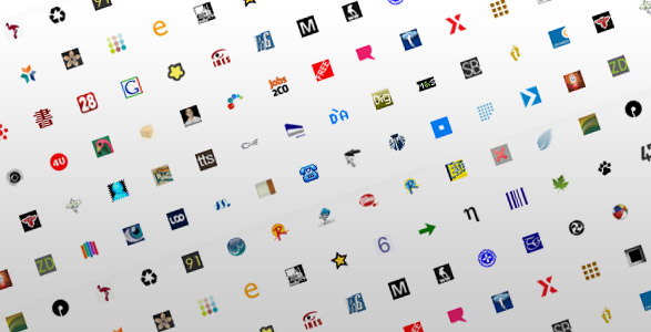
Favicons can be as small as 12×12 pixels, which can feel restrictive for some people. Instead of seeing the size you have to work with as a limitation think of it as an opportunity to flex your creative muscles. Rather like how a haiku requires you to carefully select each syllable, designing a favicon needs restraint – but the result can still be special.
Make your favicon
Show your brand’s unique spirit
And you will succeed!
Using too many colours carelessly

Google’s photo-sharing service Picasa manages to use different colours effectively, but it’s easy to get it so wrong – lots of colours in a small space can merge into an indistinct smudge. This why you’ll notice that the majority of favicons stick to just two colours – and one of these are usually white. If your brand use multiple colours think about how you could limit your palette while staying on brand. However, just like the Picasa favicon, yours may be the exception to the rule, so if you can create something colourful and concise don’t let convention make you play it safe for the sake of it.
Using colours that don’t match brand
Fancy experimenting with your brand’s colour? Your favicon is not the place to do it. Selecting a colour not associated with your brand to use for your favicon will only lead to confused customers. Nothing demonstrates professionalism as taking the care to make sure continuity runs through every way you represent your brand – right down to that tiny little favicon.
Cramming a full-size logo into a small space


If you have an incredibly simple and bold logo you might be able to simply convert it into a 16×16 pixel image and end up with something pretty good. But why not use this opportunity to be a little bit more creative? YouTube’s old favicon (left) did the job well enough, but their updated design works much better as a favicon. It remains on brand by using the same colour, and the same rounded rectangle shape, and the train play icon represents something playing.
Going in a completely different direction
YouTube took an element of its existing logo to create a brand new favicon – it’s reassuringly familiar. What it didn’t do was create something completely different and take the brand in a new and unexpected direction. It’s worth repeating: you should be striving for continuity.
Having a favicon that doesn’t stand out


Both Tumblr and Twitter could use a simple ‘t’ with a blue colour scheme for their favicon, but that would rather confuse things. Whether or not Twitter changed its favicon because of this confusion, or simply because they got rid of their old logo altogether is up for debate, but it can’t be argued that the blue bird favicon is much more distinctive than the old ‘t’. When designing your company favicon the straightforward option might be too close to a competitors’ existing favicon. You don’t want to risk your customers confusing the brand or infringing on copyrights so spend some time thinking how you could take an aspect of your logo and refigure it.
This article was written by Rob Young of moo.com, the design and print company. Visit MOO online at http://us.moo.com/ to upload your own images or use our templates and start creating remarkable products.


Add Comment