


A good visual identity is paramount for helping your business move forward. We’re going to look at some tips to help you find your own wave in this rapidly changing world.
-
Follow the Trends
One strategy for creating a modern logo design is to follow the current trends. Although they are constantly changing, trends show exactly what potential clients seek. A professional designer notes and uses trends within the last three years to inspire their work. Then, they try to predict which direction the design is going to go in the upcoming three years. Why three years? During this time, designers across the globe manage to do so much work that fashion loses relevance and becomes mainstream. However, this doesn’t necessarily mean that the logo you developed 5-10 years ago is worthless. Later in the article, we’ll discuss an array of techniques that remain relevant for long periods of time.
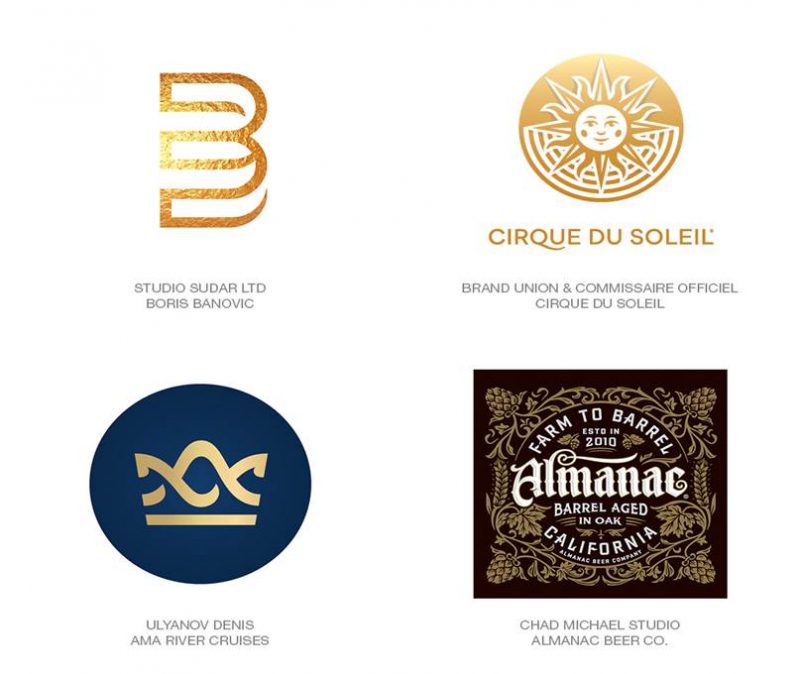
How do you know which trends are currently relevant? LogoLounge is a website portal led by famous designer, Bill Gardner, that publishes an annual logo design trend report that discusses the kinds of logos anticipated to become successful every year. Let’s take a look at one of the trends from this year. Gold is clearly in vogue!
-
Use New Technologies
As you can see from the pictures above, gold is back in fashion. Yes, it’s true that trends constantly get recycled; however, they also evolve. Gold stamping is one of the oldest techniques in graphic design that hasn’t lost its relevance. Why, then, do we see a new wave of its popularity? This method has migrated from paper to screen. Modern high-resolution screens allow us to see unhindered complex textures of metals, stones, and wood. Gold, here, appears as a symbol; it is a call to use complex textures in logotypes. Your logo can be gold or silver, even if your company will never actually need to use real gold stamping. Do you want to have a pure gold logo? Your dream has come true!
If truth be told, 4K screens are only one of many new types of technologies; motion design is also becoming more and more popular. Logos are coming to life, changing shape and color, etc. Our brain memorizes cool logo animations, and then, after seeing the static version of the logo somewhere, it can easily recreate the animation in our minds. Basically, your company’s static logo can become a kind of marker for the augmented reality in your head.
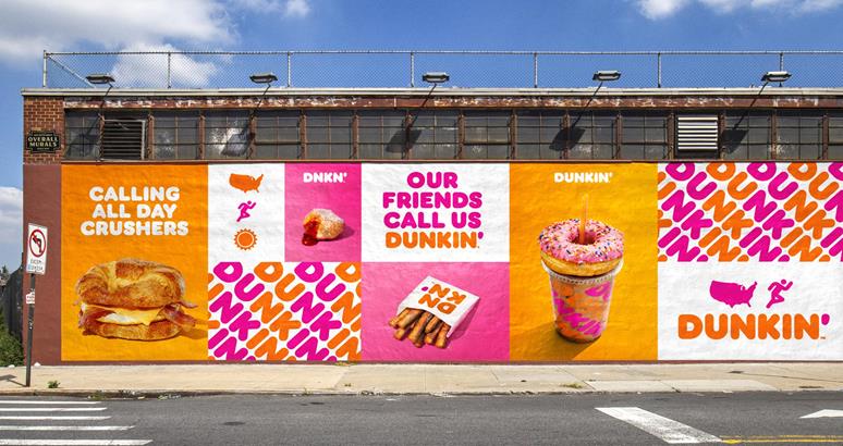
Augmented and virtual reality are beginning to slowly influence logo creation. The current trend is converting the already existing logos into 3D. However, in 5-7 years, when these technologies are better-developed and widely used, there will be new trends in logo design.
-
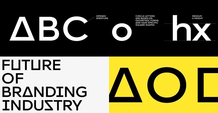
Use Modern Typography
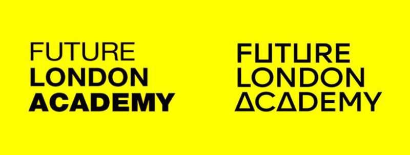
Fonts are speech translated into visual language. Similar to any visual culture, fonts have their own trends. A good designer can easily tell you which font was trending fifteen years ago. Very often, it is the font that brings freshness and innovation to the logo. Take a look at these logos. All of them are at least 12 years old. When they are paired with a modern font, an entirely new, relevant logo is created. For regular customers, the difference feels intuitive. Their perception is shaped by the big brands determined to stay ahead of the game.
Many companies have simple letter-based logos without any graphics. Such companies need to keep an eye on the changes in design trends if they want to hold sway.
-
Remember the Brand Identity System
Logos rarely exist in a vacuum. It is difficult to find examples of a logo outside of any context. Business cards, form sheets, brochures, signage, advertising, and other communication channels make up one big system. In the last 15 years, it has become customary to talk about logo development in tandem with creating an entire brand identity system. There are a number of examples where the logo fades into the background, while giving way to the overall picture; this makes a logo more modern.
Alternatively, a logo might not even have one recognizable outline, but instead it is constantly transformed and redesigned according to specific rules. These rules make the logo; this is a very modern approach.
If signage and business cards are all the communication channels you have, you do not need a complex identification system. You just need a good logo that meets your current business challenges.
-
Address Immediate Business Challenges
It’s safe to say that every business owner wants to develop their brand. You formulate clear, timely objectives, but the world is constantly changing. As a result, there’s no guarantee that the objective you set for yourself yesterday will answer your purpose today. Therefore, even the goals you set should be relevant.
Imagine that your client was a 15-year-old teenager when you began working for them. Ten years ago you developed a logo and a corporate identity that answered their business challenges and made them like you. Now, ten years later, the teenager is now twenty-five years old and is no longer your client. Over the span of that time, the world has changed so much that what used to appeal to a 15-year-old is now considered completely outdated. Remember how 10 years ago 99% of people used push-button phones? Try to give a push-button phone to a Gen Z’er and see what happens. The objective doesn’t seem to have changed, but the world has; your client has changed, too. Have you changed?
Pay attention to how different brands alter over time, and how they adapt to the new clientele to catch the next big trend.
-
Simple is Safest
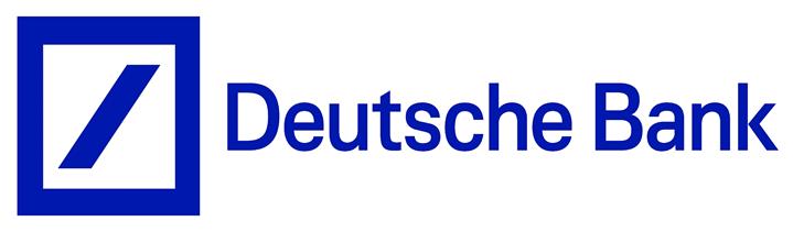
When talking about reliable design techniques, there are ways to design a logo to be solid and lasting. These types of logos are usually very simple, with clear geometric construction. They communicate simple, clear ideas that do not lose relevance over time. Let’s look at the famous Deutsche Bank logo that was designed half a century ago. It is simple and geometric. Now, let’s work through some things. What is a bank? A bank is a reliable place for storing and increasing capital. We look at the logo and see a blue square with a sloping bar inside. This can symbolize a banknote, a coin, or growth, with the bar going upwards from the lower left to the upper right.
All that a logo needs to look modern is trendy typography (see tip #3) and fitting identification markers.
-
Complicated Sometimes Means Relevant
If your competitors and customers are forcing you to become trendier right now, then forget about longevity. Do some research on what your customers need today: their interests, favorite films, frequented websites, and the products they buy. After you gather all of this information, integrate it into your brand identity. The end result might turn out to be very simple or overly complicated, but it doesn’t matter. Why not? Because your main objective is to be cool right now. Invest money in your logo, make money from it, then repeat those two steps in a few years. Perhaps this will be your business development strategy – you’re the company that always changes.
Logo design, as well as other graphic solutions, can be easily delivered by Direct Line Development, an award-winning web design company. If you have any questions, leave your comment and I will personally respond.
Author’s Bio
Hello everyone! My name is Aleksei Kudimov, and I’m a senior-level executive with more than ten years of successful experience in the IT industry. Currently, I serve as CEO of Direct Line Development, a flourishing, award-winning web development company with offices in Philadelphia, PA; Denver, CO; and Austin, TX


Great insights! It’s amazing how even a slightly different logo font can greatly change brand perception.