To say that a web designer’s only job responsibility is to design an attractive website would be presenting only half the truth…it involves so much more! The text that the website features should not only be engaging and informative content-wise but should also be legible., style and The various aspects of the text, including size, font the styling should all contribute toward making the text visible and ‘readable’ even to the naked eye; in fact, even when the user is visiting the site on the relatively tiny screen space of a smart phone.
Below are some of the fonts that every web designer should avoid:
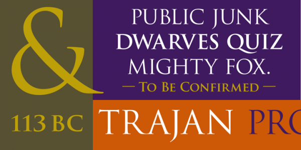
Trajan
Take a long hard look at the film posters / websites around you and you will know why it is being pointed out. It remains as one of the most used (and over-used) font styles. True, the style is classic and simplistic, but its inclusion in the Creative Suite by Adobe makes it a ready and easy option to turn to when designing and that is exactly what designers do.
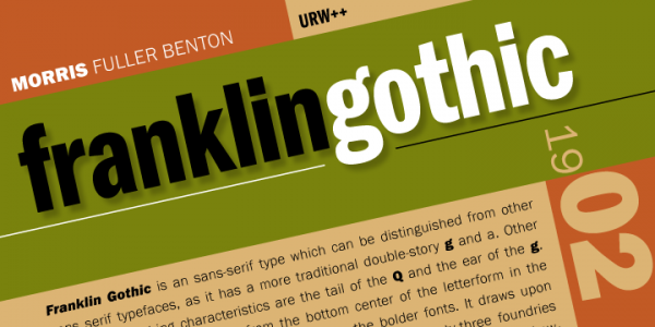
Franklin Gothic
Another classic gone bad, solely due to over-use! Steer clear of this particular style, unless you want your website to look like a copy of the millions of sites streaming around you. The inclusion of the font, while does give the site a classic look, almost like that of a newspaper; it all easily nullifies that effect too: but presenting a site that looks no different from those around.
Courier
This particular font is characterized by an irregular size and disproportionate lettering. These are the elements that contribute toward making this particular font different and perhaps this is the reason that it has been used by all and sundry. You, certainly, cannot use it for making a site that is meant for corporate consumption nor for your adult consumers.

Impact
Yet another classic! The appearance of the font is all too impressive and ends up lending the content a serious look: probably why it has emerged (an all too) favorite of web designer. However, due to overuse and the font itself appearing a wee bit too thin at times, especially when the rationale behind using the font is highlighting and emphasizing the content, it has made its way to this list of fonts to be avoided.

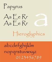
Papyrus
A favorite and a popular, hence over-applied; even though its popularity can be safely said to be a misguided effort. The font gives the appearance of a relaxed and informal setting and may end up lending a wrong impression to the visitors who come on to your site. Therefore steer clear of it.
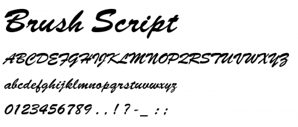
Brush Script
It is a commonly known fact that the italicized version of a font gives an informal vibe to the reader and not necessarily in a good way. Hence, while occasional use of this font may be fine, it should in no way, form the basic font style of the website.
Lucinda handwriting
Perhaps the reason why it should be avoided at all costs is, because it falls under the category of handwritten fonts. This is why it does not present a professional and serious impression to the visitor who logs on to your website. In fact the more text that is written in this particular font, the more the text appears illegible.
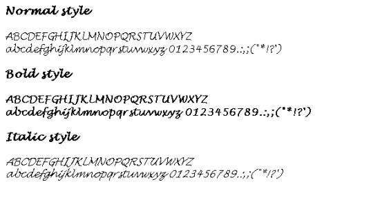
Bradley Hand
Yet another font that should be avoided, solely because it gives the impression of a handwritten text. This will only end up giving a wrong impression to the prospective customers on your web-page. Hence: avoid it!
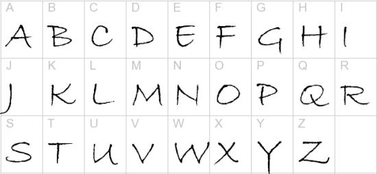
CurlzMT
Yet another font that gives an extremely informal vibe. This coupled with the fact that if there is a large amount of text (say, your entire website is written in this), it would also lead to the content being unreadable, makes it an absolute design no-no.

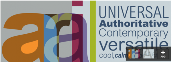
Arial
Probably the cheaper cousin of Helvetica, this is another font that should be avoided. It began to be used everywhere when the font was included in Windows3.1. Another attractive substitute that you as a designer can turn to is Verdana.
Please do let us know your views in the comment section below. If you know any font that you think should be avoided, share with us.
About the author
Ananya Srivastava, a tech writer, working with EnablingBiz eSolutions – a leading Internet marketing and web agency that offers a wide range of Internet marketing, web design and development services. EnablingBiz also provides white-label services to design and development firms in North America and Europe. Join us on Facebook






Add Comment