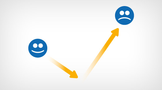
Problem with bounce rate is that it could be really high even with great content. As you are aware, bounce rate is when people leave your site from the same page they entered it. Imagine you have a really optimized article that draws in really targeted visitors, and imagine that your article is also perfectly scannable. Well done, except for two things that are likely to happen: people will be very satisfied with you content and having had their needs met, they will leave without lingering further AND, your article being easy to scan through, they will have got the required info in a relatively short period of time, maybe even in less than a minute. Both will contribute to a high bounce rate and low average visit duration even though you did everything right as far as that bit of content goes. Let’s look at what you can do to reduce bounce rate and increase visitor engagement effectively.

1. Pop Up
These are annoying for most people, and if you put off someone almost the moment they arrive on your site, can you expect them to linger once their queries are answered? An exit pop is an infinitely better option. However, don’t put in a subscription box or it could be closed immediately – people don’t always like to be coaxed into giving away their email. Why not put some interesting or funny facts with images? Some kind of engaging content could keep people clicking through a slideshow. Avoiding pop-up greetings could help in creating a non-intrusive atmosphere which might encourage a visitor to look around your site (and reduce bounce rate). The exit pop ought to take care of visit duration.
2. Content | Font
This is important especially if you have a blog that uses a theme with a default font size too small for comfortable reading. Whatever font you are using, make sure the size is around 12 points. This is not a rule, but a suggestion. Just take the time to read your own content and see if you are being forced to squint.
3. Content | Sections
Break up a long article into several sections. You can do this through pagination – the entire story is divided into distinct chapters (preferably with one image per chapter) with the ‘next’ and ‘previous’ buttons conveniently placed. Or, you could write several articles and cover the entire subject. At the end of each article, put a link to the next with the (attention grabbing) title of the article for anchor. Too lengthy posts may overwhelm a lot of people – but these same people wouldn’t mind going through the exact same length when it is presented in small sections (and with images, like we said).
4. Content | Related
The Related Content plug-in does a wonderful job of grabbing reader attention. If you manage to put attractive thumbnails along with the article snippets, half the battle is won.
5. Content | Comprehension
The Flesch-Kincaid score of your content is an extremely important metric to know if you are getting across to all your visitors. The score reflects readability of text content. Consider your target audience. Are they expected to be barely literate? Somewhat educated? Academics? The Flesch-Kincaid score can tell you all about the level of education required to read and understand your content. There are plug-ins to judge this, or you could head over to one of many websites that will help you. One such site is Readability-Score.Com. Obviously, create a comprehension level that is optimal for your target audience. Also remember that a simple and conversational language that has good grammar can be read by anyone with a bit of education.
6. Content | Mobile
In this case, by content, we refer to whatever will appear on a mobile user’s screen. We are fairly certain you have a site that is optimized for mobile devices, but how comfortably can a mobile user browse through it? If you are creating a separate mobile site, it is useful to learn about minimalistic concepts that govern such sites. This is too detailed a subject to cover here, but bear in mind the fact that users will be tapping with their fingers and looking at a relatively small screen, fully expecting to find what they are looking for, IMMEDIATELY! Mobile users are extremely impatient, and unless you design your mobile site for maximum ease of navigation, you will never be able to bring down your bounce rate.
7. Content | Design
Use white space and / or images to break up your content when it is not feasible to use separate sections. The text blocks must not appear overwhelming, we repeat. You must make optimal use of sub-heads and paragraphs so that your content may be taken in at a glance. The overall layout of the individual posts must be pleasant to the eye and invite a read.
8. Content | Distractions
Do not load a video or a soundtrack automatically as a visitor comes in. Apart from the fact that it will consume precious bandwidth and delay the loading of your page, most visitors would find it irritating that something like that is being shoved down their throat. Even if they do not leave immediately, you will still have distracted them, and they might not go beyond the page they are on, as a result.
9. Search and Found (not) Discrepancy
This is one major reason for high bounce rates. You promised something in your ad or when you posted a link on social media sites. People who are interested in what your copy says click on it and find you have in store something very different. Needless to mention, they are not going to be very happy about it. When you advertise in some manner (whether it is paid or a link posted somewhere is not relevant), you must learn to write copy that promises in a teaser what exactly it is that you are offering. Any discrepancy here will lead to very disgruntled visitors – and a high bounce rate.
10. 404
When there is a ‘not found’ error (404), make sure you say something to your visitors even if it is a basic apology and a link to the Home page. This creates a good impression and gives the visitor a reason to stay back and try anew.
11. Ads
By all means, place ads on your site – no reason why you shouldn’t, but make sure you don’t end up looking like a billboard. Ad placement must be taken into consideration while designing a page. Blogs usually have 125 x 125 square blocks on the sidebar, and these look neat. Use whatever works for you, but while ads must be noticeable (how else are they going to get clicked on?), a visitor must never be given the impression that the page is about ads and not about the content they were looking for. Your ads must never be a source of distraction and annoyance that drives away visitors even before they have checked out your content.
12. Speed
We kept the most obvious for the last. Keep your site load time between 4 and 8 seconds – the lesser the better. Use Google Page speed to understand what needs to be changed. If you need more, use the metrics that a free account at GTmetrix. Com will give you. Optimize your images, use plug-ins that will load only what is in the viewport no matter what device is being used, cut out nonessentials in every page and tidy up your source code. Bounce rate will be least of your worries if your visitors keep leaving because your site takes forever to load. And remember, in this day and age of broadband connections, anything beyond 10 seconds is forever!
Author Bio:
Rahul Makhija is a Social Media Expert at Onketing ( http://www.onketing.com/ ). He likes to blog on various SEO happenings & On-goings. In his free time he likes to study about web hosting.


Hey,
some really interesting tips. I had long forgotten that it’s important to care for bounce rate, but at the same time; these days people are more drawn to just grabbing what they need and leaving right away. I’m now trying to experiment with popups, but I have yet to find a satisfactory solution; it’s like all these different popup plugins are trying to be different from each other, but by doing that – they’re also losing important functionality..
Thank you, great article.