


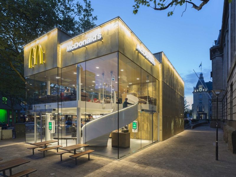
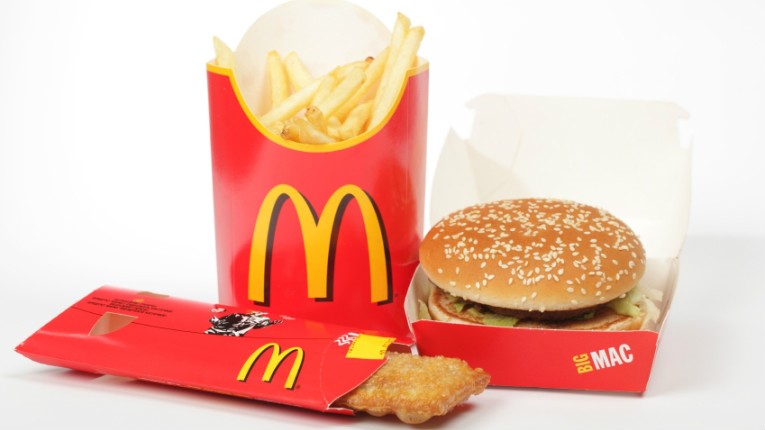
McDonald’s, the popular fast food restaurants chain and one of most valuable brands in the world, does not need to be extensively introduced. The McDonald’s brand is so well integrated into our modern culture that, let’s admit it, already the youngest children are able to recognize the restaurant’s logo, even from a far distance. Currently, there are over 36,000 restaurants in more than 100 countries serving BigMacs and featuring the Golden Arches.
First restaurant and Route 66
Patrick McDonald opened his first drive-in restaurant in 1937 which he named ‘The Airdome’. It was located at Route 66 in Monrovia, California. Three years later his two sons, Richard and Maurice, also known as Dick and Mac McDonald, relocated the restaurant to San Bernardino, California. They kept the drive-in model.
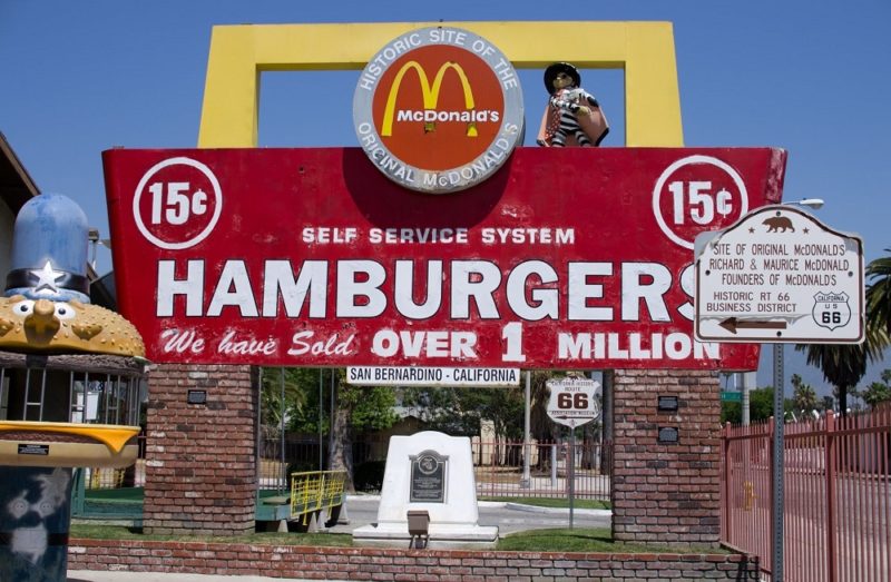
Both Monrovia and San Bernardino are situated at the Route 66, which is partly the cause of the restaurant’s great success. It was the primary road for many migrants in the 1930s. The reason for their migration was the American Dust Bowl, also known as the Dirty Thirties. It was a period of heavy dust storms in the US which destroyed the agriculture and therefore many people’s source of income. Hence, since many Americans took Route 66 heading west, many people visited McDonald’s on their way.
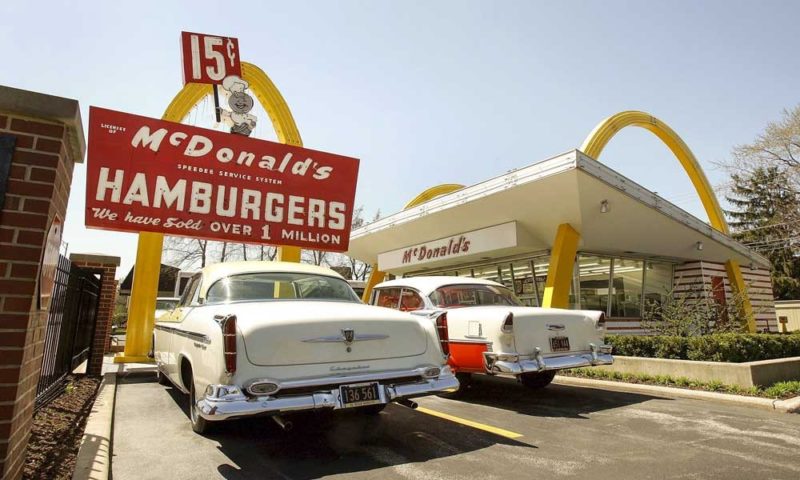
Richard and Maurice decided to hire an architect to design the restaurant’s building in San Bernardino. It was the construction that first featured the nowadays well-known Golden Arches. Its structure included two yellow arches on the sides, positioned symmetrically. But it was only a few years later that the arches were integrated into the chain’s logo and brand identity.
Quick Growth and Franchising
Fifteen years later Ray Kroc became the franchise manager of McDonald’s. Under his wings the chain grew rapidly and within decades McDonald’s restaurants were spread around the world.
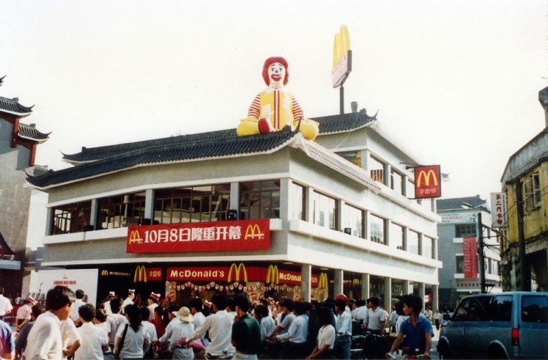
McDonald’s fast food model shaped the dining experience; first domestically, then internationally. Eating McDonald’s became a symbol of modern and urban lifestyle whereas the chain entering a country became a symbol of capitalism. The McDonald’s logo is now recognizable in all corners of the world, either thanks to the brand being present on the market or simply through everyday media.
The Speedee and First Golden Arches
Before the Golden Arches, the restaurant used the logo of a Speedee. It was a cartoon representation of a chef letting customers know that McDonald’s service is fast.
In 1961 McDonald’s introduced their first logo featuring the Golden Arches. As already mentioned, it was inspired by the structure of the restaurants’ buildings. However, it varied a little bit from the one we see nowadays.
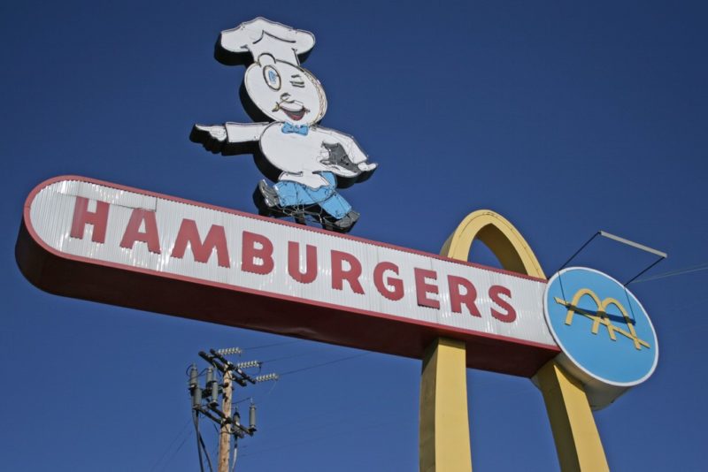
The logo was also inspired by the company’s first letter, M. However, it resembled the letter to a slightly lesser extent than what we are used to. Moreover, it included a yellow line passing through the arches. Only seven years later the company decided to remove the yellow line from its logo design.
The Modern Version
The McDonald’s logo was altered multiple times in history. However, the company, once it decided to go with the Golden Arches, never considered getting rid of them. The logo was soon developed into the company’s brand identity and remains in use for over 50 years now.

The currently used logo is the 2003 version. It was designed by Heye & Partner GmbH. Same year McDonald’s added ‘I’m lovin’ it’ slogan to its global marketing campaign.
Brand Identity Design
Primary McDonald’s colors are golden (yellow) and red. The use of the yellow should be self-explanatory at this moment. The red color represents the food industry and acts as a trigger of increased appetite and impulsive buying behavior.
The ‘M’ in the McDonald’s logo is a customized design. However, there was a font created to resemble the design. It is called McLawsuit and is available to use by the public.
At the moment the company does not plan to introduce any adjustments to its logo or brand identity designs. However, with trends changing from time to time and the company trying to be up to date with its customers’ preferences, we might witness minor alternations in the familiar Golden Arches.
Author Bio:
Natalia Raben is International Business student taking care of marketing @ DesignBro (https://designbro.com). Lover of design, photography and the arts.
My LinkedIn: https://www.linkedin.com/in/nataliaraben/


Add Comment