Parallax design is at the forefront of web design principles. The new three-dimensional display of objects has been capturing the attention of visitors all over the web and is being used by the veterans in the advertising industry: Nike and Volkswagen. Let’s take a look at how parallax design is used in modern-day website development and how this new design principle is accomplished.
Creating The Parallax Effect
The Parallax effect describes the process of layering images to provide a three-dimensional illusion. The images move around the website at a variety of speeds to create this effect. This effect is also commonly known as parallax scrolling. The new effect makes website navigation intriguing for the average user. The use of the parallax effect is new in website design, but the concept has been around for years. Here is some examples of how to implement parallax design:
The Layered Method. This particular method uses horizontal or vertical lines to create intriguing website images and pages.
The Sprite Method. The Sprite method uses several images to comprise a single image. The image displayed will demonstrate the parallex effect when one of the images is at a different position on the page.
The Repeating Pattern Method. Several individual tiles comprise one scrolling display. These tiles have the capability of floating over a repeating layered background.
The Raster Method. This method uses an image’s lines made of pixels. These lines are refreshed in an order from top to bottom. This method uses the delay between drawing one line and drawing the next line to create the three-dimensional effect.
These effects are accomplished by using tools such as jQuery, CSS, JavaScript and MooTools. There are a countless number of tutorials online to guide users through the process of making a website based upon parallax design methods.
Why Parallax Is So Popular and Why Users Love It
Parallex design is popular because it is visually appealing. The images are displayed in a fresh new way. The new perspective is just what web designers needed to make websites stand out from the crowd.
The design features seamless navigation and makes images appear crisp and realistic. The goal of any website is to capture each visitor’s attention and entice visitors to remain on the page. Parallax design is just one way to accomplish this goal.
Examples of Parallax Design
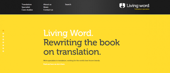
The Living Word. As users scroll on the page, the background changes direction based upon the direction of the scroll. The header remains in the same place. The images and text appear in three-dimensions and provide an interesting effect.
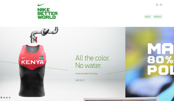
Nike Better World. This web design is one of the most popular parallex website designs available on the web. This particular design has delighted the viewers for quite some time. This website features a runner and text stating the website is made of 100 percent recycled advertisements. Nike Better World has inspired others to adopt the concept.
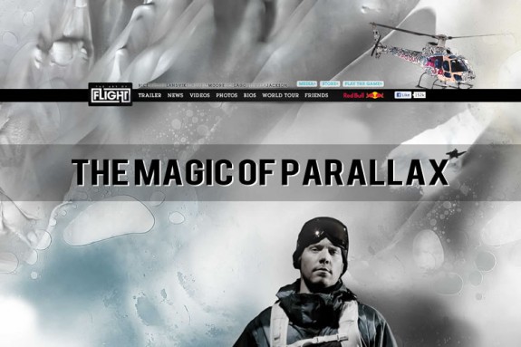
The Art of Flight. The Art of Flight features images with incredible depth and clarity. This is one of the best examples of parallex design available on the web.

Conclusion
Any company wanting to capture the attention of an audience should consider parallax design. The concept is relatively easy to master with basic design tools. Consider how parallax design can improve your website design and attract more visitors.
Nicola Byrne writes for Calverton Finance, a UK company specialising in invoice factoring and payroll finance.



Add Comment