Creating a Sign up Form is not something new thing in the Web designing field. Web developers deploy latest technologies to create interactive sign up forms. Some Websites ask for fewer details, while some ask for more information. The requirement of user information solely depends upon the product/service being provided on a Website. For online stores like Amazon and EBay, it becomes quite necessary to verify user’s email address, credit card information, and even shipping address while finalizing the purchases. Yes you’re free to ask the information required, but you must have to consider the visitors’ point of view as well.
If a visitor found your sign up Form large, complicated, or difficult to fill then he/she immediately leaves your Website. Non-interactive sign up forms can reduce your chances of getting good number of signups and give the opportunity to your competitors to generate more money. In this write up, we’ll highlight a few effective ways to make Sign up Form more interactive.
Don’t ask for Sign up until required.
It is commonly observed that visitors stay only for 5 to 20 seconds on a Website to check whether it is useful or not. As soon as a visitor lands on your Website, engage him in the activities directly like creating a Family Tree, creating a Toolbar, creating a Web application etc. even before asking for sign up. The industry’s best examples in this regard are illustrated following:
- Nokia Ovi App Wizard – This Nokia Ovi Website directly engages the visitors to create a Nokia Ovi Application and after few steps it asks for registration. Visit its URL and you’ll notice a big green button ‘Get Started’. The application is saved so that visitors can browse it again after creating login ID and signing in.
Screenshot of Nokia Ovi App Wizard Website
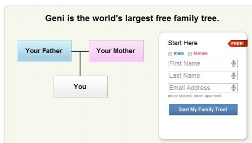
- Geni – It provides a free online service to build your family tree and invite them to expand your family tree. Browse this Website and start creating family tree. While you’re busy in creating your Family Tree, it creates your login Id, sends an email with a default password, and logged you in automatically. You can save the Family Tree and then it redirects to your Geni profile page where you can verify your email address. Geni also allows you changing the default password with user-defined one.
Geni.com – Browse, start creating Family Tree, and then Login
It is noteworthy that you should save the visitors’ work automatically or give him/her option to save the work if you’re engaging him/her in activities directly. If you don’t save visitors’ work then you’re wasting their precious time and loosing potential buyers/readers. We’ve seen various Websites, which engage the visitors in creating some applications or toolbars, ask for sign up, and after that redirect them to home page from where they’ve started with no saved work at all.
Please avoid these practices and straight away ask for Sign up if you immediately want them to do so for accessing services or products.
Fewer Details
Analyze your Websites and services/products being offered on it. Now, decide how much you should ask from your visitors to join your Website and use the services/products. The visitors like the sign up forms asking fewer details. The Sign up form to create a new email address asks more details than sign up form to create an account on social networking Website.
Most of the Websites relies on the existing email address of the user and verifies it through a conformational email. Why you do not follow this approach? If you’re not providing any services/products on the Website then just ask the user to fill the boxes
- Name
- Email Address
- Password
In case of paid services, you can move on to ask Address and Card/Account details. For a better perspective, we suggest you to divide the sign up form in parts with an option to skip this step and continue.
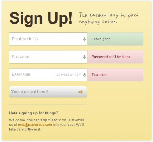
Sign up Form of Posterous
Posterous only asks for three things: Email Address, Password, and Username to login. Even if a visitor doesn’t want to fill it then he/she can just send the article via email to get it published.
Remember Me
Use social connectivity and Oauth options allowing users to register with their existing login IDs. You can integrate following options to ask users for registration with their existing accounts and access their details provided to the account providers. You can use these details to verify the users’ identity, details, and location. Following are few social login options, which you can use: –
- Google FriendConnect – Registers your Website and allows visitors to login with Gmail, Twitter, OpenID, AIM, Netlog, and Yahoo!
- Facebook Registration allows user to register with their Facebook ID and Facebook Login Button allows users to login with their Facebook ID.
- Sign in With Twitter
- Login with LinkedIn
- Login with MySpaceID
- Login with OpenID
You can also take help of third-party developers like Janrain Engage and Gigya to use the social login/registration options on your Website. However, these services are paid and sometime costlier. You can easily implement Google FriendConnect and Facebook Registration/Login buttons on your Website as compared to others mentioned above. For example, Yahoo gives you leverage to login with your existing Google or Facebook ID.
Yahoo giving options to login with Google or Facebook accounts
Automation of things
- Automatically checks the username and show its availability while a user is typing or just finished the typing. For example, twitter.com shows on-the-fly whether typed username is available or not.
Twitter validates the username as soon as a visitor types it in the box
- Auto-complete the text fields created for Country, State, and City. When a visitor types first letter, the list itself demonstrate the options so that users can choose it quickly.
- Auto-fill the text fields based on others. Suppose a visitor has entered the City code, you can set the scripts to automatically fill other options like Country, State, and City. However, you should leverage the visitors to correct them in case of any mistake.
- Auto-focus and highlight the first text field as soon as a visitor arrives at sign up form. It is also required to set the proper keyboard navigations so that visitors can fill the form without much difficulty.
- Let the users to fill the dates manually from keyboard instead of browsing a Calendar to select or choosing a date from drop down menus. You can notify the desired format to enter the date along with the text fields.
- Sign In the users automatically as soon as they click Submit or Register button after filling up the form. Avoid asking them to visit the link to login to save their clicks.
- Combine both the Sign up and Sign In forms on a single page. If a visitor is new then they can fill the sign up form or just login.
Altering the CAPTCHA
CAPTCHA or reCAPTCHA are quite necessary to combat the spam. However, you should find their alternatives from time to time. Instead of showing the default CAPTHCA, you can ask text based questions like “What is two + two?” or “Is fire hot or cold?” Both of these questions are funny and robots cannot bypass them as they need some to enter the answer in text field.
If you want to be more innovative then you can adopt Honeypot CAPTCHA Approach, which allows developers creating a honeypot using JavaScript and then to use CSS to hide from human users but not from robots. Still, the visitors browsing from a smartphone or tablet will always see the CAPTCHA form even if you’ve applied honeypot.
Google reCAPTCHA is a good option to use if you want to go for default validation. However, if a visitor is using Mobile device, smartphone or tablet to browse your Website then it will be quite difficult for him/her to clear the default CAPTCHA or reCAPTCHA libraries. In such cases, you can use JavaScript/XML to detect the browser type and show relevant CAPTCHA, means default CAPTHCA/reCAPTCHA for Desktop browsers and text-based questions for mobile/tablet visitors.
Better Navigation
- Highlight and properly place the options like ‘Sign up’, ‘Login’, ‘Forgot your Password’, ‘Submit’, ‘Register’, or ‘Help’ clearly. The visitors don’t have to strive for finding these useful links/buttons.
- Arrange the navigation properly so that a visitor knows from where to start and where to end.
Conclusion
The design of Sign up Form decides whether a visitor will become a user or potential buyer. We’re inviting our readers to add more points through their valuable comments to design a sign up form in a better and innovative perspective.
Author Bio:
Keshav Arora associated with Seo-Semantic-Xhtml, a specialized division of Ipraxa – a full service web agency, offering services like PSD to HTML and Integration with third party applications like PSD to Magento, WordPress, Drupal, Joomla etc.


Add Comment