Writer Alex Morris (me) has of late been learning to get his head around web design and managing sites courtesy of his experienced colleague Jareth Smith. It’s a mixture of uneducated, often blind optimism versus the guidance of a learned hand, but one thing has come out of this endeavour – together we’ve noted the little instances on many websites we visit where a design isn’t quite right. Inconsistencies and errors, however slight, can leave a mark on your reader base so it is best to correct them to make for a streamlined experienced.
Due to this merger of writer/designer we’ve been able to explore our site’s failings and pinpoint the 10 ways we believe everyone can improve their web design. These are fairly basic suggestions to consider when running a successful site, and we hope our combined efforts will aid you in boosting the overall appeal.

1. Lead the eye to the key information
One of the most notable issues we discovered was the habit of visitors tending to scan information before reading or viewing content in any detail; clearly it’s important to create page layouts that lead the eye to crucial information. In many ways this aspect of web design is similar to newspaper page layouts with headlines, introductory paragraphs and images preceding the main content, and the reader should be quickly led to the information they are seeking.
Along with laying out text in an accessible and easily-digestible format, visual images and graphics can be employed to lead the viewer’s eye. This can include quite explicit visual techniques such as arrows, lines connecting information points, eye-catching images, highlighting text, using different colours and areas of light and dark to emphasize elements within your web design that take the viewer to the more detailed content.
2. Give the content space to breath
Web content should be easy to read and view, and aiming for minimalist page layouts gives the content the space it needs to breath. Overcrowded pages confuse the eye and make it difficult for the viewer to quickly find the information they are looking for; simple, clean page design creates a much easier and pleasanter experience for visitors. The “white space” isn’t to be feared – those gaps can help your design look more aesthetically pleasing.
3. Make the site easy to navigate
This probably sounds like a “duh!” statement but it is crucial your visitors can find their way around the content and pages – this means creating an easily understood navigation with clear icons, buttons, menus and links. The site map should also have a clear logic that enables visitors to swiftly find the content they are looking for and find their way back to where they started.
4. Consider usability and accessibility
Websites should be usable and accessible. The former is for convenience and the ease with which visitors can enjoy viewing a website. The latter allows for possibilities such as some visitors not being internet literate who may want simple instructions. Addressing these issues can make for a better experience all round.
5. Keep you alignment in order
Alignment in web page design is another important way to help guide the viewer to content. This includes taking into consideration the layout of images, paragraphs, headers, links, buttons and any other visual element within the design. When designing the alignment of web pages it’s helpful to use a system of grids along with headers, footers, side bars a consistent form of columns and rows for the main content.
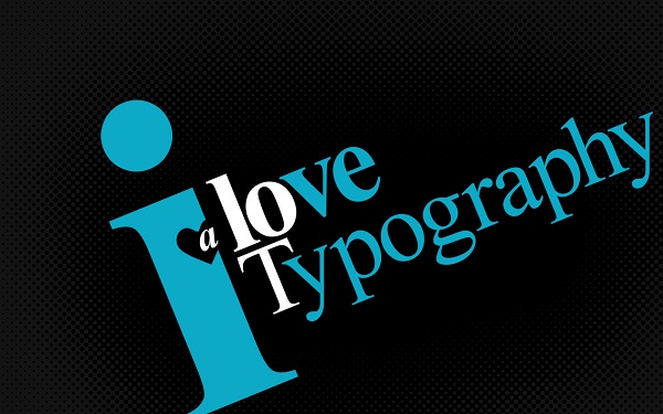
6. Get your typography right

Handling typography correctly is a big issue for most sites; all of the text needs to be readable, and this means selecting a legible font and font size (including taking into consideration the content may be viewed on different types of device) and laying out the text in way your readers will intuitively find useful. Lines of text should be short enough that the eye smoothly follows to the next line – a maximum line length of one alphabet, 26 letters, is a good rule of thumb.
Whilst it’s usually best to opt for a simple font such as Arial, Helvetica or Times Roman, you may want to consider using a more distinctive typeface to reflect the character of the text, but always remember readability is the priority.
7. Keep your content consistent
Consistency throughout a website gives a sense of character; using the same layouts, icons, buttons and other visual elements provides the visitor with familiarity as they navigate through the site’s pages. The same goes for your written text – keeping the same tone is important to establish your overall image.
8. Avoid pop-ups and obtrusive advertising
An infuriating part of visiting some websites is the sudden arrival of a pop-up ad you have to find the tiny “x” to close, meantime the add mocks you by dancing about the place. Obviously many websites depend on advertising revenue for their up keep, but any featured adverts should not dominate or distract from the content.
As for pop-ups – they’re obstructive to a user and will likely drive a number of your visitors away. Do away with them. We’re surprised there hasn’t been an “anti-pop-up” movement yet!
9. Consider different devices

Your initial site map should allow for future building whilst menus and pages should be adaptable and easily added to. The diverse range of devices and screen sizes available means your site should be set-up for this; “Responsive Design” as some are naming it. Standard desktops, laptops, tablets, smart phones and other handheld mobile devices all need covering. Luckily web pages are adaptable things so put the effort in to cover some extra angles.
10. Break the rules!
The internet is a highly creative place which allows for fantastic ideas of inspiring lunacy – the issues we have outlined above are subjective and it is entirely possible you may need/want to design websites which are deranged, psychotic, schizophrenic, and bewildering. Just remember, however, these should be conscious decisions and not the result or poor design work. Let your imagination run wild, just don’t forget to remember the basics.
Alex Morris is a writer for an ink and toner cartridges firm in Manchester, England, where he and his colleague Jareth Smith keep an eye on the company website and the HP supplies that help drive our site. Alex has recently been learning to keep an eye on the website to make sure it doesn’t do anything stupid without his permission. It’s going fairly well!


Add Comment