Happy 2012 everyone! And what better way to start 2012 than with a review of the web design trends for the year. Now, please allow me to be the first to tell you that I am no psychic nor am I a fortune teller so I won’t be able to guarantee that the following trends will definitely become the most popular designs. Instead, this list of designs is based on what I had observed of the shift in the web design world over the years as well as the emerging trends that were seen in the later part of 2011. So, in a way, I guess it is a good prediction of what’s to come.
Responsive Web Design
I am sure you will agree that this is the one significant design trend that will surely be embraced by more web designers in 2012. In the near future, mobile and tab browsing would have overtaken PCs and laptops as the preferred choice to surf the internet. This creates a demand for easier navigation on various screen sizes as well as devices. That’s where the responsive web design comes into the picture.
Quite a number of websites have already started implementing this and I am seeing many premium themes providers who are also jumping into the bandwagon and offering more responsive design themes towards the end of 2011. It is still a very new concept but I am pretty sure that by end of 2012, most web designers who are worth their salt would have mastered this concept.
Animations, CSS3 and jQuery
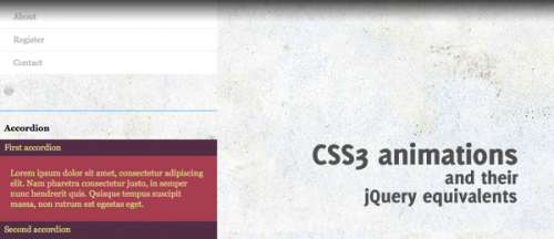
Animations have always been a part of web designs for it was able to capture the attention of its audience and for a good number of years, Flash animations dominated the animation scene. However, with the introduction of HTML5, CSS3 and jQuery in the recent years, Flash animations usage has seen a drop and a further decrease in websites using Flash is to be expected in 2012.
Animated effects created with HTML5, CSS3 and jQuery have been given the thumbs up by many web designers not only for producing great animations but also because of its ease of use and less coding lines. With the attention that they are getting, I am sure the developers would be working hard to release newer versions and providing better user experience soon.
Huge Images and Photos As Background
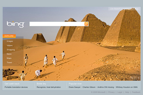
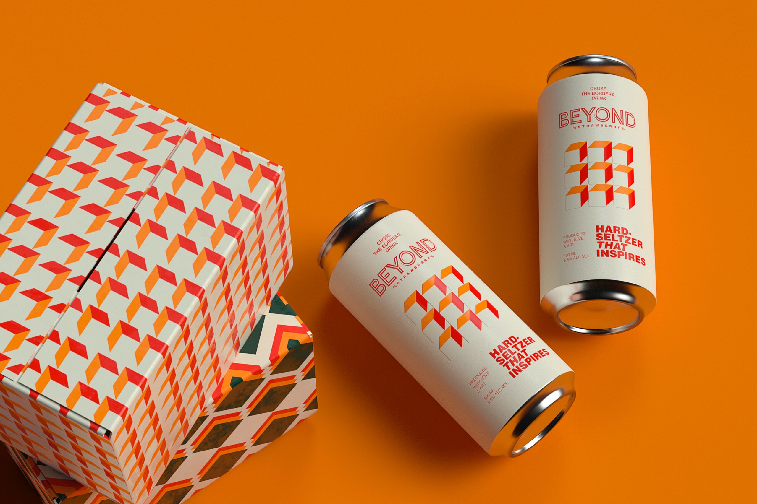
I have seen the concept of using huge images and photos as a website’s background, gaining popularity in 2011. And I think the trend is going to continue in 2012. Thanks to faster internet connection speed, easy availability of image optimizing tools and of course, the affordability of digital SLR cameras, both professional web designers as well as amateur website owners are happily adopting this method.
This is not surprising, for more often than not, these breathtaking superb quality images are great at capturing and mesmerizing viewers so much so that they will want to check out that website. But do remember that there need to be a balance for it’s the contents that you want your readers to view and not just the images.
Fixed Navigation
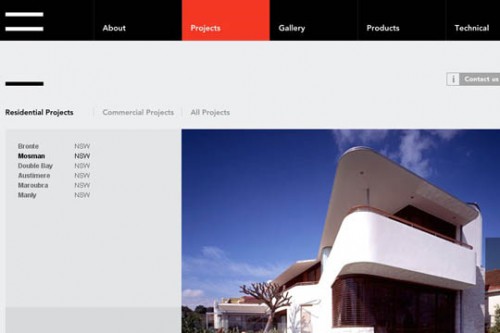
The fixed navigation concept was introduced a few years ago and the response was pretty good initially especially on personal blogs before this trend started to drop. Then towards the second half of 2011, the fixed navigation trend seemed to have re-gained its popularity and is seen in a variety of websites.
As modern internet users tend to have shorter patience, it is crucial for websites to maintain a level of interactivity and introduce easy navigation in order to persuade them to stay longer at that particular website. A fixed navigation will provide the users a link tool that is locked at certain corner as the users scroll down the page, thus offering a hassle-free experience.
Infographics
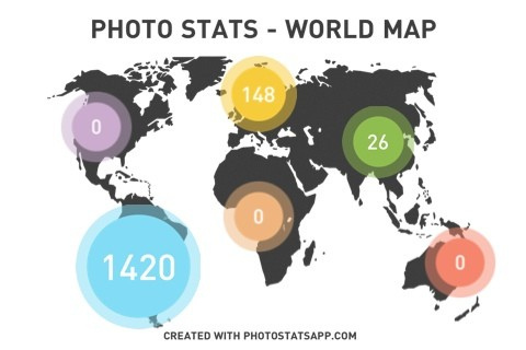
This is another trend that is fast gaining popularity and I think there will be more infographics websites to come in 2012. This trend is an example of a good marriage between content and user interactivity. Information is presented in easy to understand and fun image and is no doubt more successful in sending the message across than just plain text. Check out some of these cool infographics websites.
There you go, a few of the top web design trends for 2012, based on my study and observation. I would like to stress that there are a lot of other interesting concepts and trends around and they are by no means less superior to the ones mentioned above. But these are the ones that I believe will influence lots of websites in 2012. Technology is moving at lightning pace and things are never constant. We are seeing lots more of innovative designs lately and I am sure this is just the beginning. The future is definitely an awesome one where web designs are concern.
Jasmine is a professional web consultant who is thrilled to share her web design and web hosting experiences. She blogs on her web hosting review site. Her favorite web host is Bluehost. Do check out her website for great web hosting deals.




We’re definitely using responsive design with our new websites. I love how it ensures the website looks good no matter what the screen size is.
Infographics are popping up everywhere now. People love sharing them! making them valuable for SEO :)
I totally agree about the responsive web design…since I got my iPhone 4s my laptop has been gathering dust! Although it is annoying that my iPhone doesnt view flash so hopefully the use of things like html5 will boom in 2012 and solve this for me :) or apple will sort the job out…whichever ;)
Good post, I agree completely with redking, infographics are popping up from everywhere these days, don’t get me wrong, I love a good infograph, so keep them coming.