


Color has become an essential element of every logo design. With that said, many designers concentrate greatly on incorporating the best image and font style, but fail to give adequate attention to the color scheme. By doing so they are missing out big time. Proper selection of the color scheme not only enhances the overall appearance of the logo, but also helps in communicating the intended message.
Woh, Wait a minute! What does the color scheme have to do with communication of ideas? Trust me, color has a lot to do with it. Different colors tend to evoke different thoughts and emotions. To help you understand the meaning of different colors, I’ve compiled a listed below:
Black: implies boldness, power, elegance and sophistication.
White: This color is used to depict tranquility, purity and goodwill.
Purple: Well this color is used to portray creativity, royalty and elegance.
Orange: is a sign of playfulness, energy, creativity and excitement.
Green: This color suggests harmony, healthiness and vitality. It is also known as the color of freshness.
Yellow: indicates warmth, exuberance and confidence. It also one of the most striking colors.
Pink: is more of a feminine color. It evokes innocence, beauty and youthfulness.
Red: is one of the most used colors. It implies aggression, passion, dynamism and hunger.
Blue: is a soothing color. It arouses a sense of serenity, comfort, trustworthiness and security.
Brown: depicts traits of reliability, stability and the natural color of the earth.
Now that you know the meaning of different colors, choosing the most relevant one for your logo design will no longer a hassle. My humble advice to those designers who neglect the importance of color, give colors their share of attention, because the difference between a perfect and mediocre logo design could very well be the color scheme.


Life can not do without color, loss of color, you will lose a lot of very interesting things, life will not become colorful.The importance of color in our lives is very evident.
Have you studied the effects of culture regarding the interpretation of color?
Hari
Hi Noel
Thanks for this great article. It’s short, snappy, easy to read and understand. It’s a lovely example of the KISS principle in writing – keep it short and sweet.
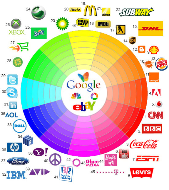
I really like the graphic with the logos of well-known brands circling the colour chart. A very good way to draw the reader’s eye and make your point. Did you create it yourself? It’s very clever.
I chose the colours purple and deep hot pink for my website, which is in production. I didn’t know what those colours meant; I just chose them because I like them.
In fact, I like them so much as soon as I bought my house in July 2003, I got a painter in to paint over the (to me) sickly apricot/peach colour inside and out, which had just been applied two weeks previously; it was practically still wet! I briefed him to go crazy with purple and deep hot pink on pretty much every surface he could reach, bar the ceilings which I left white so visitors didn’t go into cardiac arrest. My furnishings are those colours, too, with a bit of white to leaven the mix. Sounds hideous, I know, yet I love it!
Thanks for letting me know I am ‘vibing out’ creativity and youthfulness. I feel my choice of colour (not popular with everyone, as you may imagine), is sending out the right message, as these attributes express how I feel about myself and my work.
Cheers from Caitlin Foster in South-East Queensland, Australia
I find interesting the selection of colors and their meaning for each logo, very useful thanks