


Photos can change how you feel about someone, or something. To really make an impact on your audience and to get them to recommend your company over another, you need to pick the right images that will help you rise above the competition. Even if you didn’t think you needed to consider new ways to use photos, there’s good reason to reconsider. Here are some ideas for styles for stock photography that will help you get noticed, and will make you memorable:
Infographics
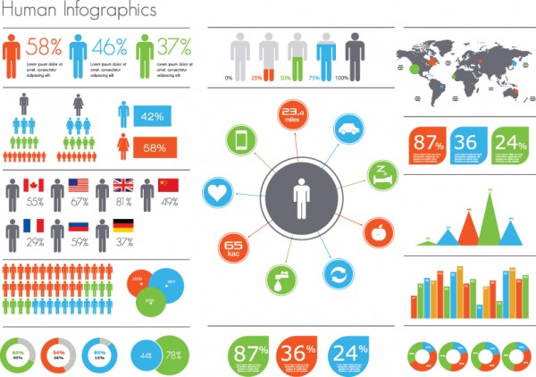
Infographics, when done well, can be downright impressive. They’re also a popular medium to use on the web, where we seek a faster and fresher take. But they are a lot of work to brainstorm, create, and execute. Pre-designed infographics templates will significantly lighten the load, allowing you to plug in the data and information you wish within a formatted framework. It limits the need for design resources and empowers anyone to make gorgeous charts that will resonate with both employees and outsiders.
Design elements
Those of us who are tired of looking at the same stale slide in presentations will be relieved to know that it’s easy to liven them up. It just takes the use of a colorful image that can showcase the outline of a plan, team, or goal. Bar graphs and pie charts are a thing of the past; today, we want our graphics to jump off the page and tell a story of their own. Breaking down complicated ideas into one easy-to-understand slide is an effective way to get people to pay attention and get the gist.
Textures

Designers often look to embellish and finish their images with “distressed” effects to make the image look old, or worn, or made out of some other natural texture. Whether applying some grit to a font, or applying a wood-texture for a more tactile feel for your design, having a library of these “special effects” at your fingertips will make creating compelling, richly detailed designs as easy as pie.
Predesigned templates

The internet is full of fun sites that allow you to upload your own JPG of people’s faces to be included atop the bodies of characters of a video. Apply the same techniques to work with templates that ask you to fill in empty spots. For instance, if you wanted to show off what a certain ad would look like on a billboard, you can download an empty billboard photo and stick your ad copy and imagery on top. Inserting your own images in the right type of frame can give you a real sense of what a final product will look like. And you can then make sounder decisions.
Typography
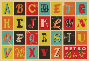
Even the best-written article or ad campaign can fall prey to the wrong font. Choosing the right typography can be difficult, but stock photography essentially hands you the letters to work with. Sample different styles before downloading, making sure that the font lines up well with the copy. Additionally, pre-designed typography can have color and detail that regular fonts simply aren’t capable of providing. Giving people a new font to look at that’s different from what they’re used to will go a long way to helping them connect with the material. And once they connect with something, they’ll want to share it with everyone they know.
Danny Groner is the manager of blogger partnerships & outreach for Shutterstock.


Add Comment