


Business Card Design Psychology is an infographic sponsored by Cardprinting.us. It seeks to teach aspiring graphic artists to learn the basics in achieving a cohesive work that stays consistent to practical and aesthetically-motivated design guidelines. This infographic tackles proper choice of color, typeface, and whitespace, relative to the specific demands of a designer’s ongoing project.
Here’s ” The Psychology Of Business Card Design ” infographic in a nutshell.
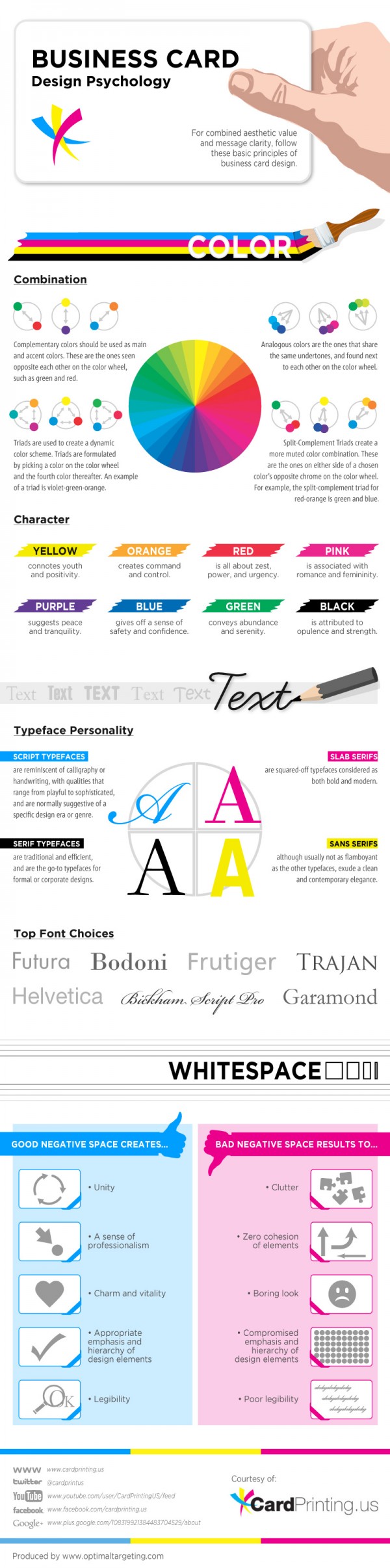
Color choice and combination
Color is arguably one of the most subliminal components of any given design; may it be a webpage, a campaign, or a business card. Through proper usage of color, much can be achieved by an artist in terms of capturing a sense of charm and character. Furthermore, knowing which colors best suit a given project heavily relies on an artist’s understanding of key concepts such as complementary colors, analogous colors, triads, and split complement triads. These color combinations give off different aesthetic qualities, hence, must be employed with utmost accuracy and sensibilities.
Typeface preference
The most common typefaces include scrip, serif, slab, and sans serifs. Each of these gives off a unique personality and should be expertly employed so as to avoid a design faux-pas. For instance, serif typefaces go best with formal or corporate designs, whereas slab typefaces better serve modern and bold design requirements. The crucial guideline in ascertaining which typeface is most suitable to a specific project; the first question which an artist should ponder on is the kind of message which the design ought to eventually and ideally communicate. Getting the right answer to this seemingly simple query can very well secure a work’s professional quality.
Whitespace execution
Where an artist places or situates his or her chosen design components is just as critical as the choice of components which he or she deems essential. The design canvas, no matter how big or how small, should be efficiently maximized without falling prey to the curse of design clutter. It is also imperative that blank spaces are incorporated deftly in a way that they offer a point of visual rest, without coming off as dull or lazy. In graphic design, for business cards specifically, emphasis is virtue—this means that despite the limited space or canvas, the design still allows proper compartmentalization of components.
This business card design infographic is a fitting touchstone for individuals who wish to be in-the-know with regards to the most essential elements of visual potency.
Infographic by Cardprinting.us.


Add Comment