Have you ever thought about what combination of graphic elements would represent you as a person best? What configuration of lines, colors, patterns, images, and text would completely summarize and communicate everything important about you to others?
If you haven’t, try it now. I’ll wait.
Difficult? You bet it is. I asked you to visually represent yourself and everything you stand for, to generate a completely unique graphic that distinguished you from everything else—in short, I asked you to make a logo for yourself.
One of the most vexing things about logos is that you often feel like, because they represent your company and all the complexities inherent in it, they should be as complex and colorful as possible. The impulse to create an ornate logo, is a dangerous one, however, and should be ignored whenever possible. (And it’s almost always possible.)
Great logos are simple.

Think of the best, most iconic logos: Nike, McDonald’s, Coca-Cola. All three are simple, controlled, and use almost exclusively single lines and text to create a brand image.
When trying to develop a new logo, or redesign an old one, there is only one characteristic you should consider: simplicity. Try to focus on line, duo-tone color schemes, and text only at first. See what you can produce limiting yourself to simple elements first, instead of trying to incorporate every design trick you’ve ever learned.
Complexity is your enemy.

Complexity takes time to comprehend and appreciate, and time is your enemy. A logo should be simple enough that people absorb it without having to think about it. It should appeal on an almost instinctual level, which is why simplicity rules. Our basic instincts are simple, not complex.
Furthermore, when you introduce more and more elements into a logo, you have to make sure every element is successful, both by itself and in concert with the other elements. Problems with logos will increase exponentially with more elements. This is primarily because it is hard to control so many elements at once. If you constrain yourself to line, color, and text, or even only two of these, you’ll have that much less to worry about.
If it is confusing when it’s small, it will be embarrassing when large.

Another reason to keep things simple is that complexity is confusing, distracting, and sometimes even just plain ugly, when it’s big. It’s all well and good to have that extremely intricate logo on a polo (the size of a quarter), but when it’s on a billboard (the size of a car), people probably won’t even know what they are looking at.
Similarly, when you shrink the complex logo small enough to fit on a golf ball or a pencil, it will probably be indecipherable, and may as well not even be there at all. Simplicity works no matter the size or topography of the surface it’s printed on. (Golf balls have dimples, pencils are octagonal or cylindrical.)
Colors are costly.

The more colors you try to incorporate into your logo, the more expensive it will be when you print it, and the worse it will look when you are only able to print in black and white. Duo-color schemes are appealing because the color can be subtracted, but the contrast will remain in black and white. Think of the Starbucks logo. Would it look any worse if the mermaid (or whatever it is…) were in black instead of green? Nope. You’d still immediately recognize it, and associate it with the best coffee you’ve ever imbibed.
Designing a new logo doesn’t have to be frustrating, and shouldn’t lead you to an existential crisis. Calm down, get back to basics, and keep it simple.


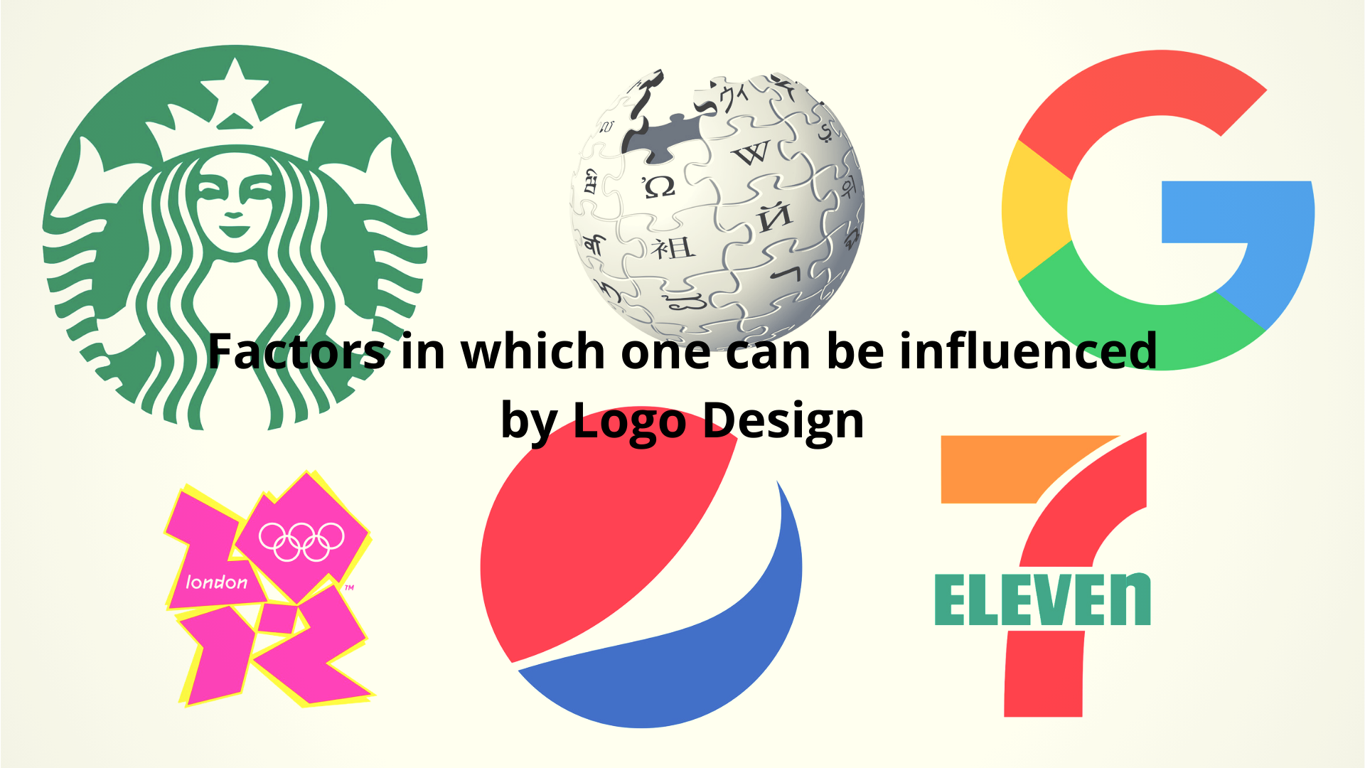
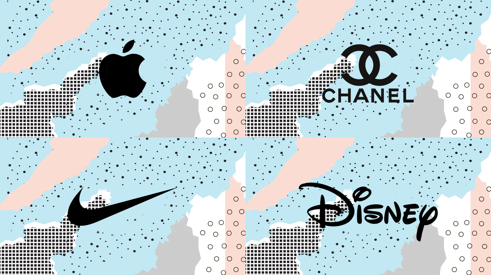
True !! a simple logo will work in any case !!
A PASSION FOR CREATING LOGOS: Here are my thoughts – Appearing on almost everything an organization produces, no other single graphic element has as many responsibilities as the logo. Not just a pretty picture, a logo is THE unique visual definition of client and/or product. A key signature, it is the window to their core identity, invoking emotion, establishing individuality, capturing personality and promise, creating a memory and triggering a response. It is the heart when creating design standards, a major ingredient when developing brand recognition and a vital factor when establishing customer recall. Professionally, there are few design rewards greater than creating a logo that is right on the mark.
Remember: Research, concept, simplicity, clarity…communicate.
Well, right in the simplicity of the logos, I did a lot of trouble on the design of my logo for my blog.
I spent much time trying to design a logo with many images and colors, and go about 4 times to change the logo on my blog, now thanks to your advice I will make a simple but eye-catching logo.
Thanks for the information.
Important points have been mentioned. I’m a designer and I always aim for a simple logo. Here’s my logo for my company http://inventikasolutions.com
Its a circle with ! cut out from the negative space. What do you think of it?
Some good tips here; I always think a logo should look good big and small, good in colour or b&w, and simple enough so people recognise your company straight away.