


Talk “web design” and you’d realize what was working just about two years ago isn’t working today. Trends are a part of the evolving web. As the web grows and the user behavior changes with it, web design trends also change. As of now, the web is a vortex with multiple factors affecting this change.
Whether you are a designer or a business owner, it helps to keep yourself abreast of these changes.
Remember, however, that these are trends and not rules. Most of these are experimental. They’ll last until something better comes along.
Here are 8 web site trends that are ruling the world of web design today:
Mobile-Only Design
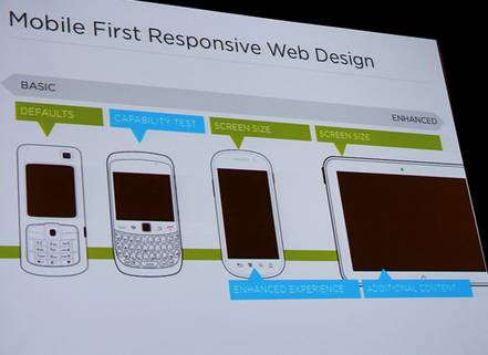
There was a time when mobile-first made sense. Luke Wroblewski wrote his book Mobile First on that premise and it did serve well.
Lately, we’ve seen that even “mobile first” seems to be doing injustice to the fast-growing mobile adoption of the web. Luke Summerfield of HubSpot alludes to a Morgan Stanley report that claims that Mobile Internet usage will match desktop usage by the end of this year.
Given that mobile usage is exploring, a positive UX/UI is key, and that the whole web is shifting base to mobile, websites need a “mobile only” strategy. From mobile specific design, websites can then scale up and fit the desktop when needed.
Josh Chan of Six Revisions even believes that Responsive Design isn’t the future of web design. Google recommends a “mobile-only” approach, he points out.
Mega Menus
On one hand, conversion experts scream out aloud for simplicity. On the other hand, there are mega menus that seem to have enveloped the web.
While we don’t know for sure how long these will last, large online publications certainly find the need to have mega menus that are working for them.
Paul Boag of Smashing Magazine wrote on navigation for mega-sites. To put it simply, it’s a trend that seems to provide solutions to extremely large, fully loaded, magazine-type, online publications catering to multiple audiences.
Paul asserts that these mega menus work because traditional navigation cannot support content depth, multiple entry points, and multiple topics.
Knowing web design well though, we can be sure that mega menus are a pain on mobile devices. Will it continue to work its charm on at least the desktop versions?
Only time will tell.
Custom Image Galleries
Chances are that you have a tablet. We can bet that you have a smartphone by now. You do like the “swipe” thing to see your images, don’t you?
While it’s a common feature on all smartphones today, it’s something that’s missing on the web overall. If you are on a desktop, you are mostly still “clicking” to see images.
You won’t be clicking if this experimental customized image galleries making use of JavaScript and CSS goes full-stream. Image light boxes and dynamic carousels will all begin to look and feel different. Here’s what CoDrops did with elastic dragging effecton an otherwise normal image gallery.
Welcome Micro UX
Whether most businesses are taking to it or not, mobile is critical for business presence online. Microscopic attention to detail is what mobile demands and as Chris Lake of EConsultancy.com points out, Micro UX is a growing trend.
The menus, navigation, hover states, copy, fonts, and everything else will need that detail when displayed on mobile sites.
Wondering what kind of detail Chris is writing about? See a huge list of 17 Micro UX affects that he wrote about.
From simple vertical menus, to product descriptions on thumbnails; from direction-aware hover affects to animated check inputs are all a reality today.
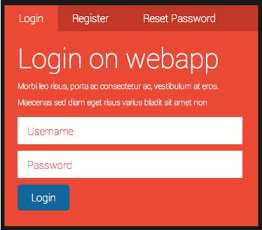
Less is more
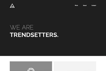
It’s funny that we had to wait until 2014 (and it’ll take a few more years before it sinks in), to embrace minimalism in web design.
The over-arching trend is to go minimalistic on design. Minimalist navigation, mobile-specific text display, larger fonts, CSS replacing images, rich online experiences, and varied typography are all mandates for better conversions.
Playing your cards well?
When swipes overtake clicks and when mouse gives way to your finger, things ought to change. The way you interact with websites is getting more visual as we write this.
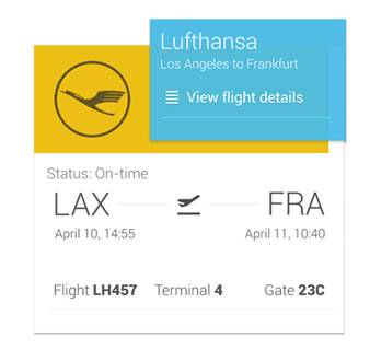
That brings us to “cards” and “Pinterest-style” display. Starting with Twitter and Google, the web is moving to “cards”. Twitter cards are now in motion, as Benedict Evans explains itwhile Google has Google Now while cards are also the primary element on products such as Google Glass.
Pinterest began with the cards approach and Spotify embraced it lately.
Want proof? Intercom has a post on why cards are the future of the web.
It’s time to take those cards seriously.
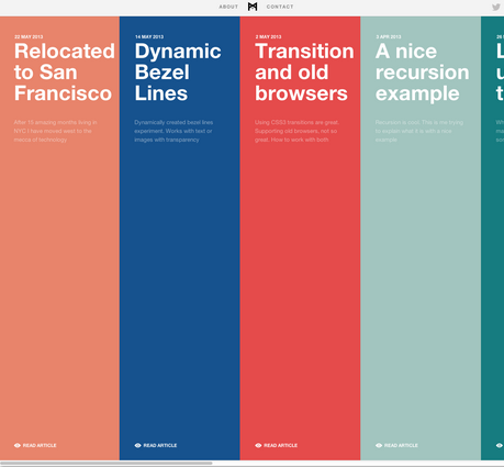
Monster Imagery
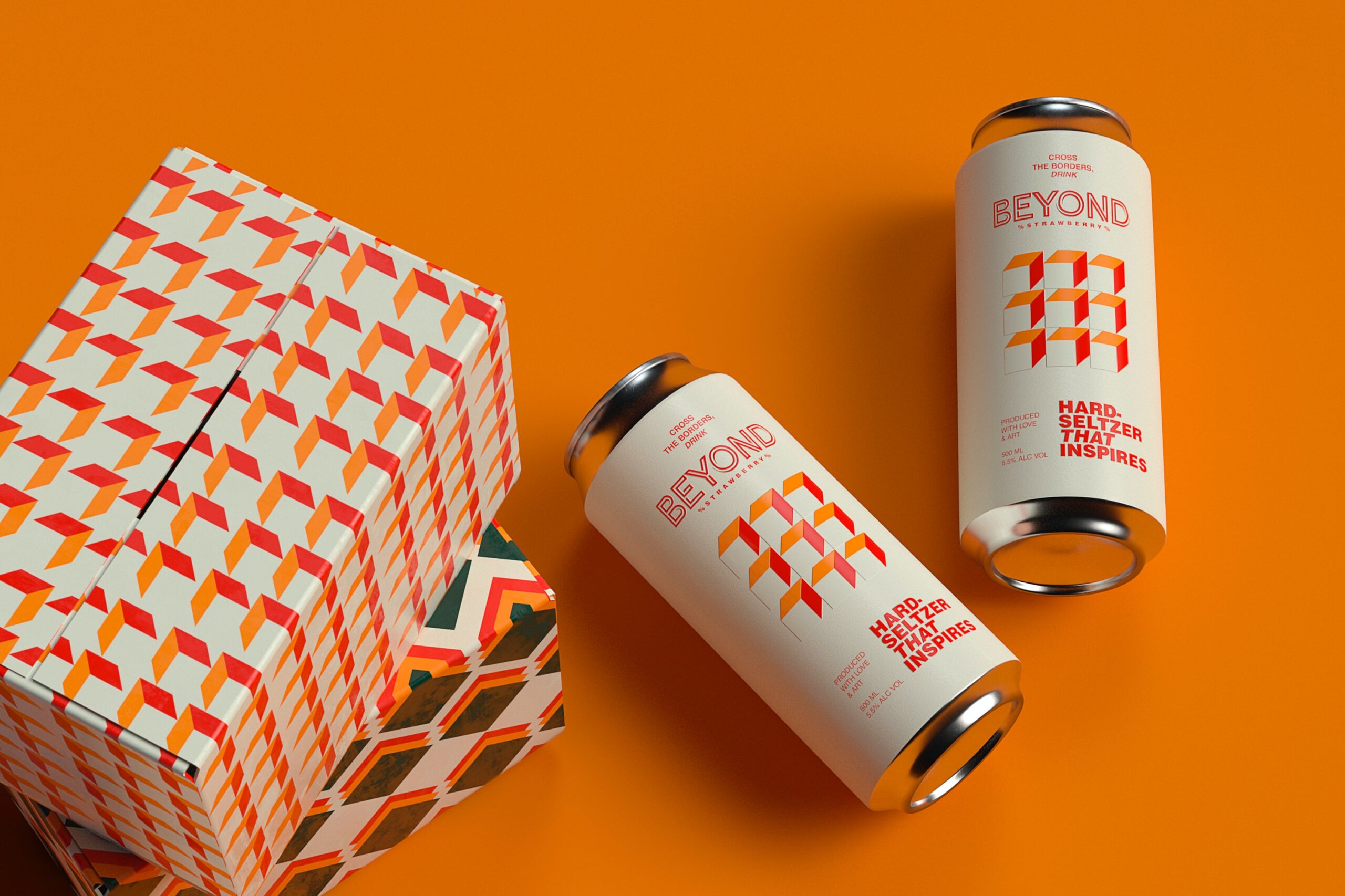
While you’d have to be careful about where and how you use images, the web is now a visual medium.
We’ve come a long way from text, haven’t we? Take one look at AwwwardsOf the Day and you can’t escape the monster images that seem to be on every winning website.
Whether these images boost conversions, get extra sales, or make a business function better is still debatable, the world of design is certainly making cameras and high-quality images a staple.
The Polychromatic web
Who wants one, when you can do better with many?
Colors are an important part of the design process but we now have to deal with abundance. While too much color can be overpowering, a few branding experiences can certainly get the boost.
Hyper colors are a trend sweeping the web now.
Take a peep at these 24 colorful web designs and the polychromatic web will hit you square.
User experience is in for a treat, with careful treatment of web design with multiple-colors.
What are some of the trends we missed out on? Which of these trends do you bet on? Share your inputs with us.
Michael Georgiou is a dynamic business professional and entrepreneurial guru with a proven success in creative strategy, online branding, project management, and communication projects in both the public and private sectors. He drives Imaginovation’s rapid business growth in marketing and sales due to a multifaceted and versatile communications experience with a reputation for providing innovative turn-key digital solutions, and a steadfast approach for managing teams to provide high quality web products and services in numerous industry verticals. A large portion of Michael’s experience is working with reputable clients in delivering a wide range of solutions for web design and application development projects, as well as managing the user interface and user experiences on a high level marketing perspective. Michael holds an international Master’s degree in Business Communications Marketing from Bond University in Australia, and a Bachelor’s degree in Public Relations and Marketing from UNC Pembroke.


Add Comment