Do you want to know how to properly come up with a great email design that lets you attract more customers? Check this article out and learn useful tips!
Global email subscribers are anticipated to reach 4.3 billion by 2022. Members of your target audience, also known as quality leads and prospects who may be reached and converted through email, can be found among all of those people. Your email design must be on point if you want to ensure that your emails stand out among the rest and attract the attention of your target audience.
In this article, we will discuss what email design is, why it is important, go through some tips, and provide you with examples of amazing email designs. With that, let’s get started.
What is Email Design and Why is it Important?
The process of deliberately creating and developing an email that resonates with your business’s target audience, specifically your present email subscribers and clients, is known as email design.
Of course, for you to stand out and get noticed by your target audience, your email design should be eye-catching, aesthetically beautiful, and on-brand. One of the best email designs we’ve found is Preply, which is a language tutorial provider.
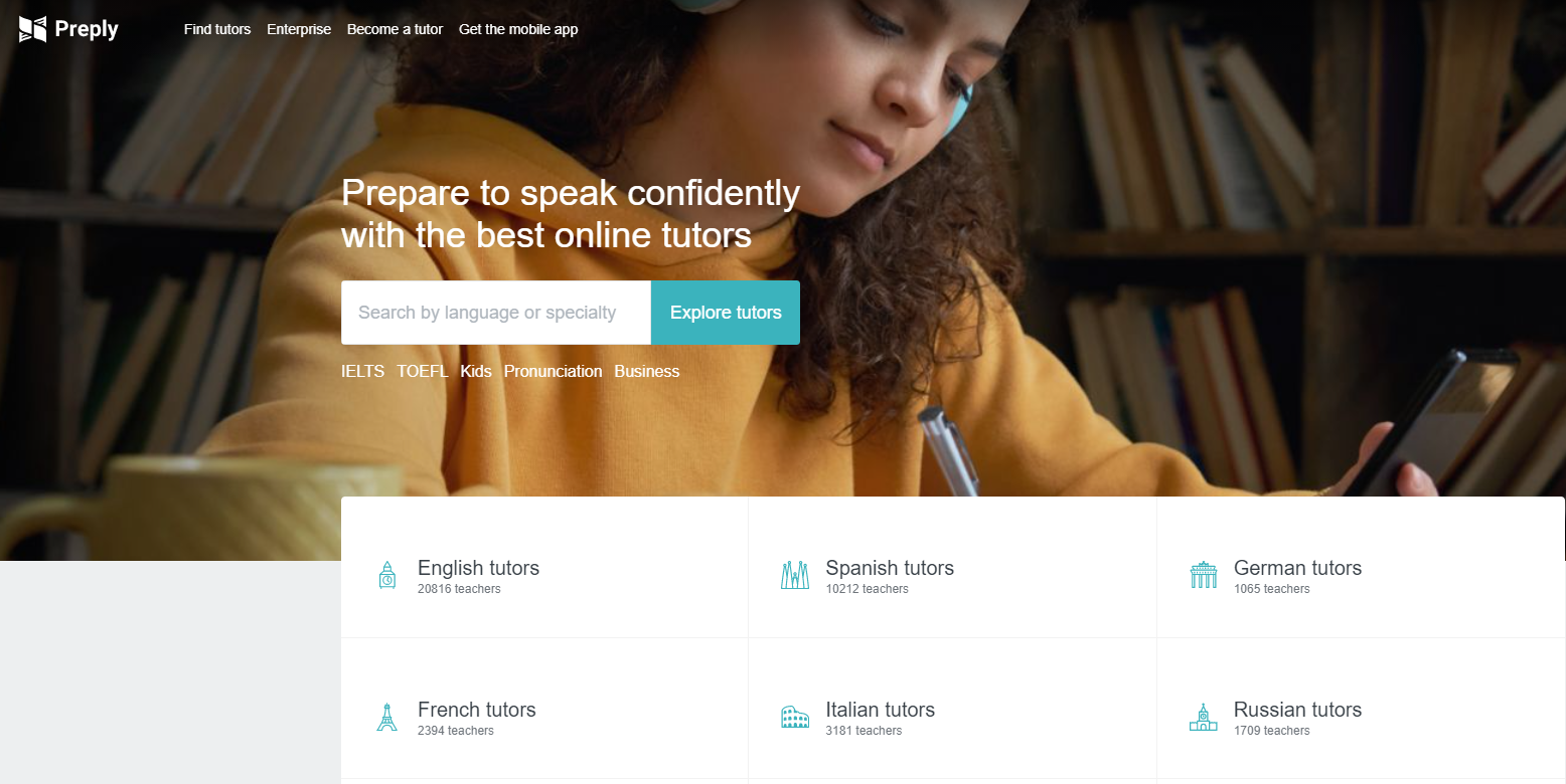
Now, before we move on to the next section where we discuss the tips for email design, let’s quickly talk about why email design is important. Why is it important, by the way? Simply put, email readers tend to frequently skim over a set of information and delete emails that don’t provide value or appear to be overly dense. This is the reason why having a great email design is so important as it will help you capture your email recipients’ attention and make them be engaged with your brand.
The importance of email design is so simple yet so immense for brands. Therefore, you must come up with a well-thought-of design that will help you optimize this platform. Without further ado, let’s go ahead and talk about the things you need to do for your email design.
Make sure that your email design is consistent with your brand
First and foremost, when your recipients open your email, they should be able to tell it was from your company. That is to say, your email should have a distinct identity that is unique to your business. Consider the following strategies to keep your email on brand:
- Use the same colors and fonts as your other marketing and branding pieces.
- Use a particular tone that is consistent with your other marketing and content materials, such as on your website and social media platforms.
- Include your logo, social media account links, website link, and relevant calls-to-action (CTAs) for your products or services. This is a fantastic approach to raise brand recognition and enhance conversions at the same time.
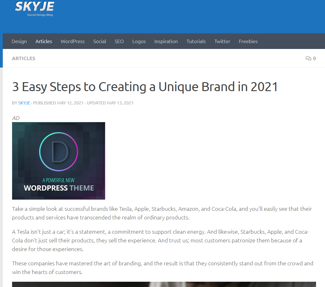
Of course, while it’s easy to say to display your unique identity as a brand, some of you are actually still unsure about your uniqueness. In that light, here’s an article we recommend that you can read on how to create a unique brand for your business – 3 Easy Steps to Creating a Unique Brand in 2021.
Create a powerful subject line
When you send someone an email, the subject line is the first thing they see. It’s the short sentence that’s designed to grab your recipients’ curiosity. It should pique their interest enough to make them want to open your email and read on.
With that said, make your subject line entertaining, relevant, and personal for your recipients to open it and see your email design. Remember that excessive use of capital letters and superfluous punctuation, as well as certain terms, might set off spam filters, so be respectful of your readers and refrain from going there.
Additionally, keep in mind that longer isn’t always better when it comes to email subject lines. It’s crucial to remember that your subscribers read your emails using a range of browsers and email applications, as well as mobile devices, so you have to ensure that your subject line is readable enough.
Make an eye-catching preheader text
The preheader of your email is comparable to the meta description of a web page in that it gives a glimpse of what the email is about. It’s the second thing people see when they open the email. Rather than recreating the first sentence of your email, you can use the preheader to give your recipients a sneak peek at what they’ll be reading in your message.
Preheader texts can give meaning to your subject line and increase open rates dramatically. As a result, you should keep it brief (40-70 characters) and to the point. Use this section to explain why your consumer will find the email valuable.
Your subject line and preheader text should function together, so it would appear as if you’re telling a story to your reader. If you don’t change it, it’ll read the same as the text that displays at the top of your email, which can be something like “View this email in your browser.” Of course, it’s not a great way to introduce your brand. Customize as much as possible!
Be brief but comprehensive
Give your email recipients the information they want and need without getting bogged down in the details. This will demonstrate that you appreciate their time, which may help you increase email subscriber retention.
Actually, being concise in your online correspondence is no longer something new since it’s always been a practice in the SEO industry. In fact, there are several guidelines about this, which also cover how email should be handled and one of the things that have always been said is to be brief yet comprehensive.

Include unique visual content
It will be tough to keep recipients’ attention and keep them interested in your message if they open an email and just read paragraphs of material. Instead, break up the text material with on-brand and engaging photos, GIFs, videos, animations, and other media to create an unforgettable experience.
Personally, what we enjoy the most are GIFs. If you want to include moving material in your emails, they’re a terrific alternative to employing video. The more animation, colors, and frames in an image, the larger the animated GIF file becomes. Only animate what you need to animate, keep it brief, and don’t use every color in the book to keep them as tiny as possible.
Personalize as much as you can
It will feel more considerate, personal, and even professional when you customize an email to your receiver. Personalization of emails also aids in the humanization of your brand. This personal touch helps you build a relationship with your email subscribers and increase retention rates. But, in general, how does one personalize their emails? This is accomplished through the use of dynamic content, a syntax that allows you to specify the type of material that will be shown to a certain subscriber.
In a basic sense, you might simply type out your subscriber’s first name, which would appear inside your message. What if you don’t have access to such data? In the event that the first name is not provided, you might provide a fallback message.
Moreover, it’s noteworthy to mention that more advanced use-cases of dynamic content help you to display a whole different message based on client information contained in your database. You may use this to display the number of points your subscriber has accrued in your loyalty program, or you might even display them a different set of products based on what they’ve looked at on your website or what they’ve bought in the past.
Incorporate a responsive design
Your email’s format adapts to the screen it’s being viewed on, whether it’s on a laptop, desktop, or mobile device. Your recipients should be able to read your emails without difficulty regardless of where or how they are viewed. Making sure that your email design is adaptable to whatever device your audience uses, you can boost your UX and email retention across all these devices.
Talking about a responsive design also touches on the idea of layouts. Your email’s style should make it easy for your receivers to absorb your message’s material in the correct order. You’ll most likely utilize one of several popular email layouts, such as the zigzag, one-column, two-column, and inverted pyramid. Lastly, you may also need to look into your email’s width, length, spacing, and padding.
Choose the appropriate font
The fonts you use determine how your emails look and feel. While the internet contains hundreds of thousands of fonts, not all of them are appropriate for email communication. In static photos and GIFs, you can use any typeface you choose (as long as it fits your visual brand identity). In writing, however, you should stick to web fonts and system fonts.
While web fonts are generally supported, they may appear differently on the device of your recipients. Montserrat, Lato, and Roboto are three of the most popular. System fonts, on the other hand, are fonts that may be displayed on any device or in any program and will always appear the same. Times New Roman, Verdana, and Georgia are among this kind.
Use the right tone
To know what form of language will function best, you must first understand your audience. Some subscription lists are more formal, while others are more casual.
For example, if your company handles online security services, then your tone should be formal. Staying true to your brand and optimizing the main portions of your email can help you write a high-performing email campaign.
Customize your email signature
Another technique to build a professional and personable tone over email is to use a great email signature design. Email signatures should include more than simply your name; they should also include information about you, your role, contact information, your company, social media links, and legal requirements or industry disclaimer.
Use emojis to your advantage
Emojis may appear to be an unneeded or unprofessional addition to an email at first glance. While this may appear to be a reasonable assumption, it is incorrect in a variety of situations.
Indeed, including emojis in your email subject line can boost open and click-through rates. However, while employing emojis for marketing, make sure you understand the meaning and connotation of the one you’re employing.
Also, we find that emojis work so well in subject lines as they can have a major impact. They cannot only replace words, attract attention, and offer a certain charm, but they can also enhance your open rates. However, you have to be careful with the kind of emojis you use since some emojis are not visible on some devices, and so they may not appear on some of your recipients’ end. Worse, they may appear only as clutter.
Include an unsubscribe button
If you send relevant material to your subscribers, email marketing can be very powerful. The terrible but true aspect of email marketing is that your recipients and customers will change over time, particularly as your company develops and expands. As a result, your content may not always be relevant for some of your audience.
With that, enable your recipients to unsubscribe from your emails on a positive note so that they remember your company favorably. Well, who knows, they might need your email content, services, or products again in the future.
To accomplish this, provide an easy-to-use and obvious “unsubscribe” button. Aside from that, you’re also obligated by law to have that unsubscribe button.
As a matter of fact, you must include a “clear and visible explanation of how the receiver can opt-out of receiving emails from you in the future,” according to the Federal Trade Commission and the CAN-SPAM Act. That is to say, providing an unsubscribe button is not an option but a requirement you must legally abide by.
Optimize with CTA
CTAs (calls-to-action) are used to get your email recipients to take action. You can use a CTA to encourage recipients to follow you on social media, visit your website, talk with a sales representative, or become paying clients, for example.
CTAs should be prominent, appealing, and clearly demonstrate why they are worthwhile to click. Additionally, you may choose to customize your CTAs so that they are tailored to specific recipients – this strategy has been shown to boost conversions.
You’ll want to make your call-to-action stand out. You may use a contrasting color and lots of whitespace surrounding your button so that it’s not only visible but also clickable for your recipients. Furthermore, your CTAs could be included in a larger graphic (such as your header) or made individually. Having separate calls-to-action is often the ideal solution, given that graphics are typically automatically banned in email inboxes.
Email Design Examples
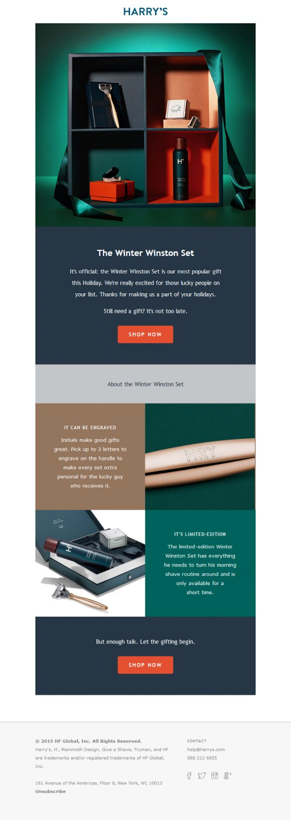
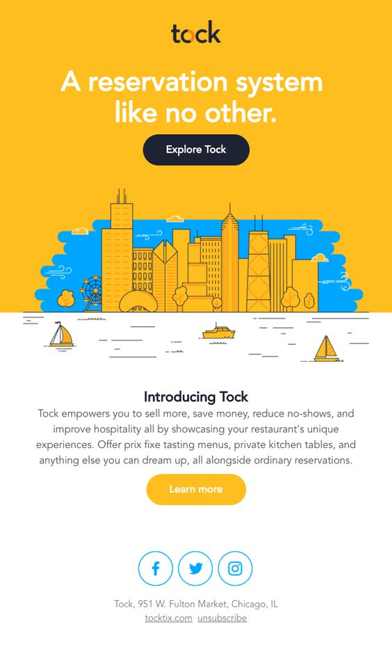
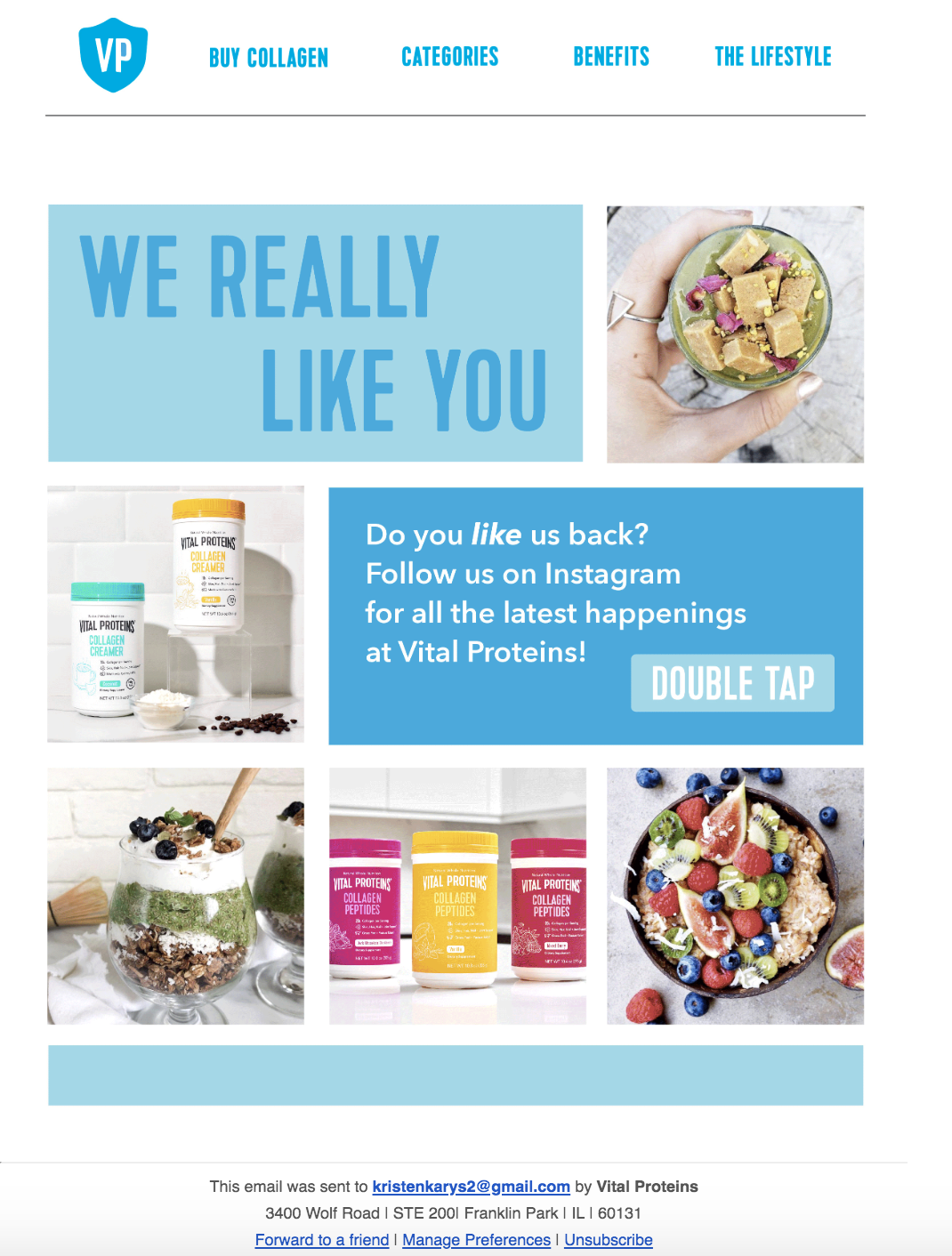
Below are some of the email designs that we love!
Conclusion
Despite the fact that email is a relatively old medium, much has evolved in the email design industry in recent years. However, smart email design will allow you to better reach and resonate with your audience members, helping you to expand. Emails that are both visually appealing and effective will aid in the development of long-term relationships and the conversion of more individuals into paying customers and brand advocates.
Author Bio
Christian Cabaluna is a finance blogger at awesomex™ with 5+ years of first-hand experience. When he is not writing in his favorite coffee shop, Christian spends most of his time reading (mainly about money-related topics), cooking, watching sitcoms, visiting beaches, and catching beautiful sunsets.
Author Picture: Here




Add Comment