


Responsive website development has become the trend of the day. Websites are now more fluid, interactive, and presentable. Responsive website development delivers uniform user experience across multiple devices. For responsive design, a number of grid tools are available. These tools help them achieve the goals of a responsive website that delivers an excellent user experience.
Introduction
Building a website with aesthetic look and feel is a key to creating and establishing an incredible online identity. The images and content must perfectly sync with each other to impress the visitor. Content organized in an order is not only appealing to the eyes, but is also easy to read. A number of tools are implemented for creating a truly effective website. Tools for making user-friendly website design are ever evolving. As a result of these web designs have improved a lot in terms of look and feel. The outcome is we now have interactive and responsive web design templates that keep visitors hooked to the website.
Responsive web development is the recent trend that has gained popularity. The process empowers developers to create a web design that fits all screen sizes and types. One of the effective tools facilitated by this process is a grid.
What is a Grid?
A Grid serves as an outline to a website. It gives programmers a specific frame within which they can work. For those who are new to the grid concept, Grid is a series of concealed vertical and horizontal lines. These lines help developers in organizing content, and images on a website. Grid serves as an imperative base, which will push your design and development process ahead.
With so many grid tools and resources available, building a grid system is not a herculean task. In this post, I am giving you a gist of some of the best grid tools that will help you build an efficient grid system and thus, streamline the web development and editing process.
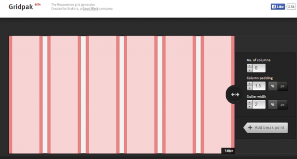
GridPak
Created by Erskine Design, GridPak serves as an online responsive grid generator. With this tool, developers can use a simple interface. GridPak provides a download file having PNGs, CSS, and JavaScript. All you need to do is specify the grid specifications and the remaining is done by the gridpak.
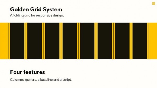
Golden Grid System
Get a firm starting point for your responsive web design with Golden Grid system. Splitting the screen into 18 even columns, it allows you to use the leftmost and rightmost columns as outer margins. So you can actually use 16 columns. The best thing about this grid system is you can combine and fold these columns into eight for tablet-sized screens and four columns for mobile devices. Cover any screen size ranging from 240 to 2560 pixels using this ‘Golden’ grid system.
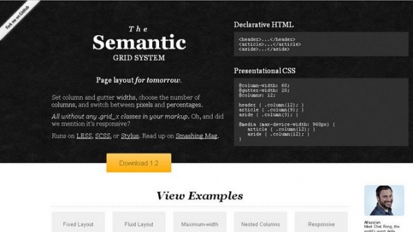
Semantic Grid System
Utilizing pre-processed CSS extensions such as LESS, SCSS and Stylus, the Semantic Grid system serves as a modern approach to the CSS grid. Enabling developers to select gutter widths and choose the number of columns directly into the style sheet, it gives a great deal of flexibility. Responsive developers can easily switch between pixels and percentages to achieve responsive layout.
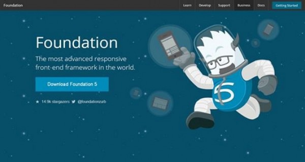
Foundation
This framework is utilized by designers and developers to build prototypes and production codes. Helping in product and design front-end workflow, Foundation serves as the first responsive, semantic, mobile-first framework. It provides a range of useful UI elements. Foundation 5, the latest version, will come with more speed in terms of building websites as well as products.
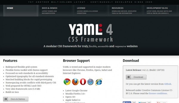
YAML
This CSS framework is compatible with almost all browsers, such as Chrome, Firefox, Opera, Safari and Internet Explorer. Being supported by a huge development community, it is frequently updated with the latest tutorials and templates.
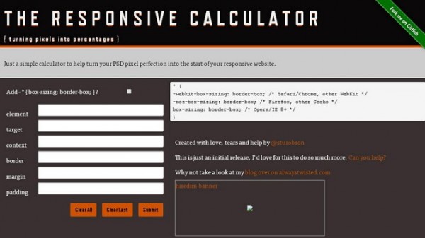
The Responsive Calculator
Turning pixels into percentages, this intuitive tool works as a simple calculator. It helps you turn your PSD pixel perfection into the commencement of your responsive website.
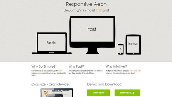
Responsive Aeon
This is a lightweight CSS3 & HTML5 powered framework, perfect for creating responsive layouts efficiently. It is fast and intuitive. Responsive Aeon is a grid system with 12 columns having 1104px width. With three basic classes, you will be ready to go with this 1 KB minified grid tool.
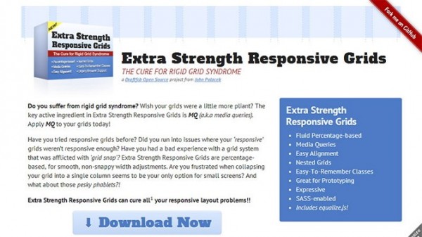
Extra Strength Responsive Grids
As the name suggests, this powerful CSS framework offers solutions to various issues faced during the responsive website designing process. It is fluid percentage-based system and offers easy alignment along with nested grids. It facilitates the use of less columns, and resizing of elements on smaller screens. This easy to use grid is perfect for prototyping and SASS-enabled.
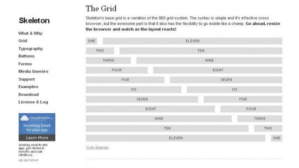
Skeleton
This minute collection of CSS files helps developers expedite the website development process. They help in creating websites that look great no matter what the size of the screen on which they are displayed.
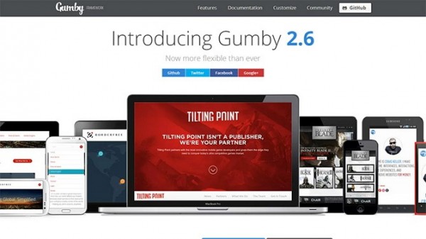
Gumby
It is a flexible and responsive CSS framework built on SASS. Helping you create quick and logical layout and application prototypes, it helps you attain speed in the development process. It comes packed with UI kit and useful tools that help personalize and build a top Gumby framework.
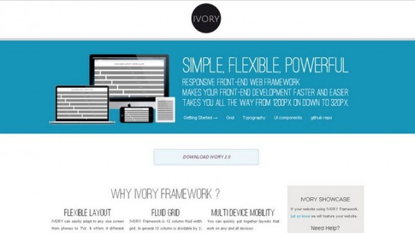
Ivory
This powerful framework can handle responsive designs from 320px to 1200px widths. With a 12-column grid, it offers different features such as typography styles, buttons,pagination, toggle-switches, accordion, etc. It is a simple, flexible, and a light-weight front-end framework.
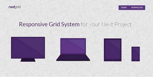
Rwdgrid
Based on a well-known 960 grid, this responsive grid system works for mobile, tablet, laptops, and wide screen displays. Developers can utilize it as a base grid system which helps in building responsive websites.
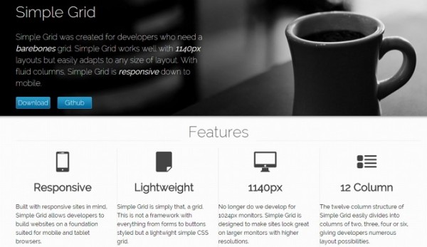
Simple Grid
It is a basic lightweight grid that offers grid for content and a grid for layout. Built in responsive layouts, it has fluid columns which make the grid, adjust to the browser resolution.
Conclusion
Prior to proceeding to responsive website development process with a grid system, it is essential to analyze various grid tools. This will help you in selecting the right tool which meets the business requirements of the client you are serving. With grids, you can ensure a great deal of flexibility. Expert designers and developers can judge the features of an excellent grid system when they work just once with it.
About the Author
Working full time with Potenza Global Solutions, Michael Waugh has gained expertise at responsive website design and development. He has rich experience in the website development field. Mastering the art of responsive development, he has also disseminated knowledge in the form of articles and blogs. Gaining practical experience, then transforming it into words is his biggest passion. He has written blog posts for a number of blogs and aims to provide more technologically accurate information to his audience.


Add Comment