


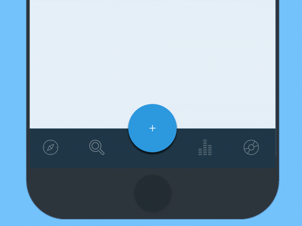
Since its debut in 2014, Android users have become familiar with the floating action button, also known as FAB. This round button floats above app interfaces and presents a call-to-action, making it easy for users to complete the next step or task. Designers predict the user’s wishes and make icons for reaching those goals instantly accessible.
Critics argue a floating access button is bad UX because it blocks content, distracts the user from complete immersion and has the potential to create frustration. For a FAB to be a useful tool, designers must know when to use it and how best to incorporate it into overall design.
What Does Google Say?
Google suggests designers use floating action buttons to emphasize activities like create, favorite, share, navigate and explore. Buttons might change color with user focus and expand to show related actions when pressed. The recommendation is to use one FAB per screen and only offer the most common actions.
In most cases, designers should use the default size (56 dp), but they can also use the mini size (40 dp) to create continuity between screen elements. To promote consistency between apps, use the standard circle shape with no additional dimensions. Designers should avoid using floating action buttons to complete the following:
- Move to trash or archives
- Create an alert or flag an error
- Tasks that have limited use like cutting text
- Controls better suited to a toolbar like adjustments for volume or font size
How does FAB Affect UX?
UX involves how users feel when they interface with an application or website. User-friendly site design creates good UX. Negative UX causes users to abandon websites, and positive UX improves conversions.
While a floating action button seems like a small element of UI, it impacts usability. If users feel frustration because a FAB makes it harder for them to complete a task, it can impact the way they feel about the brand or product.
Use FAB to Complete Frequently Used Actions
Make navigation simple and enhance app versatility by using floating access buttons for the most commonly used processes. If you’re designing a music app, the FAB might allow the user to play or stop using the same button. Shareable content might incorporate a FAB that allows users to post to Twitter, Facebook, Google+ and other channels with one touch. Camera applications might come with a FAB that allows the user to quickly take a photo.
Since use of floating action buttons almost immediately became controversial, researcher Steve Jones investigated user experience implications of incorporating them. Comparison analysis of user data indicated that at first, usability decreased, but the FAB quickly enabled users to become more efficient at completing the desired tasks.
For the study, Jones created two almost identical versions of the same application. The only difference was one implemented a FAB, while the other featured a more traditional user interface.
In both applications, the user needed to either add list categories or place items on a specific list. The application with the FAB used a “+” icon to prompt users to complete each task. The control group used regular menus for navigation. The group with the FAB initially took longer to complete tasks, but quickly learned how to perform significantly faster than users in the control group.
When testing was complete, administrators showed all users both designs and even the users more familiar with the standard design preferred incorporation of a FAB. They viewed it as easy to use and more accessible than other methods.
Use FAB as Road Signs
Just like roadside icons serve as universally understood prompts for checkpoints and relevant stops, floating access buttons serve as user signposts. For example, Twitter’s floating access button prompts users to post content. Many messaging applications have a FAB with the pencil icon to signify the user to compose a new message.
Floating access buttons move independently of other on-screen elements because of their significance. They may disappear and reappear to signal their presence. If actions move across tabbed screens, they can disappear with movement and reappear if their action shifts.
For example, if the FAB on one page is for creating text and on the next page it allows the user to access a variety of options, the button might change colors and icons as the user navigates between pages.
Supply Options
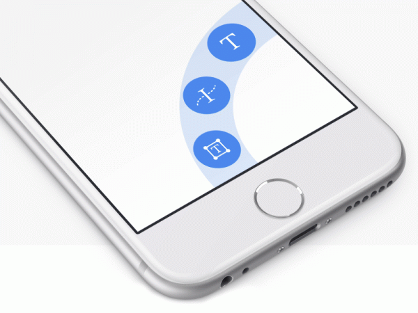
Sometimes the user’s next step is limited and they only need one choice to complete it. Other times it’s more appropriate to provide a set of actions or choices. When the user presses the FAB, it can expand to show additional options.
Evernote uses a FAB in their note-taking product that when selected allows users to create reminders, make files into an attachment, take a screen shot or write on a page. Users can easily complete the most common tasks. When floating access buttons lead to a series of choices, provide between three and six options upon user press.
Keep expanded options from blocking on-screen content as much as possible. While Evernote’s call-to-action buttons open on the right side of the screen, other designers display choices in a fan shape surrounding the original FAB, or across the bottom of the screen so most content is still visible.
Ensure lists beneath a FAB aren’t blocked when users select the button. When using a FAB to place a phone call, include enough space that the desired number isn’t obscured by the keypad.
Enhance Experiences
Always consider the user’s needs during any interaction. In some contexts, users want to make a purchase or complete a task. Other times they just want to browse content. When users just want to scroll, a FAB can get in the way. If they might want to share, post, or add to a cart, a FAB makes it quick and easy to do so.
FAB coloring is an important part of design. While red or green are standard for many applications and promote user recognition, they don’t stand out with every color scheme. Grab user attention by contrasting with the background.
Highlight shifts in FAB function by designing them to move opposite of screen content. This keeps users from trying to access FABs when they’re in transition and puts them on a unique elevation from on-screen content.
Use Animation to Create Cohesiveness
Use FAB animation to guide and delight. Here are just a few animation options:
- Trigger – Use touch animation to prompt an action.
- Toolbar – Transform FABs into a toolbar upon press or scroll.
- Speed dial – Expand the FAB into related options or a single sheet with related material.
- Morphing – Morph animation can transition the button into part of the app structure. Movement often provides a visual demonstration of the selected action.
Animation helps users transition between screens, visually acknowledges completed actions and facilitates the next step. It turns FAB buttons from tools into moments of surprise and unexpectedness.
When critics say FAB is bad UX, it’s because they have encountered designers who use it incorrectly. Floating access buttons are useful for reinforcing brand and creating carefully designed user experiences. Adept designers start with the UX data every company should collect, and from there create the most functional design for the end user.


Add Comment